# data wrangling
library(dplyr) # data wrangling
library(tidyr) # datawrangling
# analysis
library(dtwclust) # dynamic time warpping
library(depmixS4) # Hidden Markov Model
library(WaveletComp) # Wavelet Analysis
# graphics
library(ggplot2) # grammar of graphics
library(ggdendro) # grammar of dendrograms
library(gtable) # plot organisation
library(grid) # plot organisation
library(gridExtra) # plot organisationTime series clustering with Dynamic Time Warping (Part 2)
Like any good movie, my previous post, “Time Series Clustering with Dynamic Time Warping,” deserves a sequel. In this Part 2, I’ll examine athletes’ training plans for a marathon. Because marathons are so demanding, most runners follow a specific training plan to prepare. You can find many different plans on the web, like this one from Run Ireland.
In this post, I’ll attempt to cluster several simulated training plans. To do this, I will use Dynamic Time Warping combined with feature extraction techniques like seasonality decomposition, state-space models, and power spectrum analysis.
List of packages needed
Data simulation
For this analysis, I’ll create a dataset of 20 simulated athlete training plans. Ten of these will be random, while the other ten will follow a repeating pattern, but with non-synchronized dates and intensities. The main variable is the distance run each day over the 25 weeks (175 days) leading up to the marathon.
date_marathon <- as.Date("2015-10-26")
#
df <- NULL
# random training plan with runs from 5 to 40km with a high proability of non run days (between 25% and 75% depending on athletes)
for (i in 1:10) {
  random_proba <- runif(8)
  random_proba <- random_proba / sum(random_proba)
  value <- base::sample(
    x = seq(from = 0, to = 40, by = 5),
    size = 175,
    replace = TRUE,
    prob = c(runif(1, 0.25, 0.75), random_proba)
  )
  athlete <- paste0("athlete_rand_", i)
  new_df <- data.frame(athlete = athlete, value = value, rundate = seq.Date(date_marathon - 175, date_marathon - 1, by = "day"))
  df <- rbind(df, new_df)
}
# training plan with a reapeated pattern with can change according the weeks and with a different intensity according athletes
for (i in 11:20) {
  value <- rep_len(
    x = c(rep(x = 0, sample(1:3, 1)), 10, 0, 15, 20, 30) * runif(1, 0.5, 1.5),
    length.out = 175
  )
  athlete <- paste0("athlete_plan_", i)
  new_df <- data.frame(athlete = athlete, value = value, rundate = seq.Date(date_marathon - 175, date_marathon - 1, by = "day"))
  df <- rbind(df, new_df)
}
Once the data is generated, a key step is to convert the data frame into a list of time series. This structure is important because it opens up the possibility of implementing a multivariate DTW analysis in the future (perhaps in a Part 3 😉).
plan_list <- df %>%
  tidyr::spread(athlete, value) %>%
  dplyr::select(-rundate) %>%
  purrr::map(~ (.))
DTW cluster on raw data
After preparing the data list, let’s run a simple DTW clustering on the raw data to see if we can identify our two groups.
DTW model
Nclust <- 2
dtw_model <- dtwclust::tsclust(
  series = plan_list,
  type = "h",
  k = Nclust,
  distance = "dtw_basic",
  control = hierarchical_control(method = "complete"),
  preproc = NULL,
  # args = tsclust_args(dist = list(window.size = 5L)),
  trace = TRUE
)
Calculating distance matrix...
Performing hierarchical clustering...
Extracting centroids...

    Elapsed time is 0.036 seconds.
#
dtw_data <- ggdendro::dendro_data(dtw_model, type = "rectangle")
#
labels_order <- dtw_data$labels$label
#
dtw_result <- data.frame(
label = names(plan_list),
cluster = factor(stats::cutree(dtw_model, k = Nclust))
)
#
dtw_data[["labels"]] <- merge(dtw_data[["labels"]], dtw_result, by = "label")
dtw_result <- dplyr::full_join(dtw_result, dtw_data$labels, by = c("label", "cluster")) %>%
dplyr::arrange(x)DTW plot
cluster_box <- aggregate(x ~ cluster, ggdendro::label(dtw_data), range)
cluster_box <- data.frame(cluster_box$cluster, cluster_box$x)
cluster_threshold <- mean(dtw_model$height[length(dtw_model$height) - ((Nclust - 2):(Nclust - 1))])
#
numColors <- length(levels(dtw_result$cluster)) # How many colors you need
getColors <- scales::hue_pal() # Create a function that takes a number and returns a qualitative palette of that length (from the scales package)
myPalette <- getColors(numColors)
names(myPalette) <- levels(dtw_result$cluster) # Give every color an appropriate name

p1 <- ggplot() +
  geom_rect(data = cluster_box, aes(xmin = X1 - .3, xmax = X2 + .3, ymin = 0, ymax = cluster_threshold, color = cluster_box.cluster), fill = NA) +
  geom_segment(data = ggdendro::segment(dtw_data), aes(x = x, y = y, xend = xend, yend = yend)) +
  coord_flip() +
  scale_y_continuous("Distance") +
  scale_x_continuous("", breaks = 1:20, labels = labels_order) +
  guides(color = FALSE, fill = FALSE) +
  theme(
    panel.grid.major = element_blank(),
    panel.grid.minor = element_blank(), # remove grids
    panel.background = element_blank(),
    axis.text.y = element_text(colour = myPalette[dtw_result$cluster], hjust = 0.5),
    axis.ticks.y = element_blank()
  )
#
p2 <- as.data.frame(matrix(unlist(plan_list),
  nrow = length(unlist(plan_list[1])),
  dimnames = list(c(), names(plan_list))
)) %>%
  dplyr::mutate(rundatelocal = seq.Date(date_marathon - 175, date_marathon - 1, by = "day")) %>%
  tidyr::gather(key = label, value = value, -rundatelocal) %>%
  dplyr::mutate(label = as.factor(label)) %>%
  dplyr::full_join(., dtw_result, by = "label") %>%
  mutate(label = factor(label, levels = rev(as.character(labels_order)))) %>%
  ggplot(aes(x = rundatelocal, y = value, colour = as.factor(cluster))) +
  geom_line() +
  geom_area(aes(fill = as.factor(cluster))) +
  coord_cartesian(ylim = c(0, 50)) +
  scale_y_continuous(name = "Total distance per day [km]", breaks = seq(0, 50, by = 50)) +
  scale_x_date(name = "Run Date", date_breaks = "4 week", date_labels = "%b %d") +
  facet_wrap(~label, ncol = 1, strip.position = "left") +
  guides(color = FALSE, fill = FALSE) +
  theme_bw() +
  theme(strip.background = element_blank(), strip.text = element_blank())
#
plt_list <- list(p2, p1)
plt_layout <- rbind(
  c(NA, 2),
  c(1, 2),
  c(NA, 2)
)
#
grid.arrange(grobs = plt_list, layout_matrix = plt_layout, heights = c(0.04, 1, 0.05))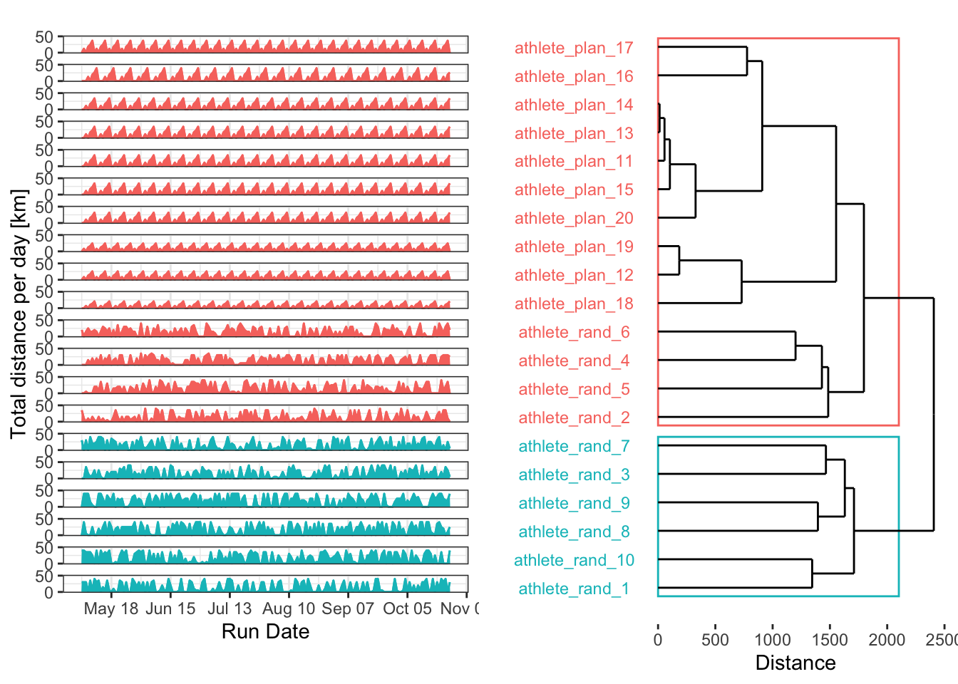
Thanks to some solutions on Stack Overflow, I think the plot looks good graphically (I’m still working on the label overlap). The results aren’t bad, but some random plans were grouped with the structured plans. Of course, randomness can sometimes produce patterns by chance. It’s also interesting that a higher number of clusters might be needed to achieve a cleaner separation.
Centroids
We can also examine the centroids to see which plans are most representative of each cluster. This isn’t very useful with only two clusters, but it can be a key tool for distinguishing between many different training plans.
dtw_model_centroids <- data.frame(dtw_model@centroids, rundatelocal = seq.Date(date_marathon - 175, date_marathon - 1, by = "day")) %>%
  tidyr::gather(label, totaldistancekm, starts_with("athlete")) %>%
  dplyr::left_join(., dtw_result, by = "label") %>%
  dplyr::mutate(label = factor(label, levels = rev(labels_order)))
#
dtw_model_centroids %>%
  ggplot(aes(rundatelocal, totaldistancekm, color = cluster, fill = cluster)) +
  geom_line() +
  geom_area() +
  facet_wrap(~ label + cluster, ncol = 1, strip.position = "right", labeller = labeller(.rows = label_both)) +
  scale_y_continuous(name = "Total distance per day [km]") +
  scale_x_date(name = "Run Date", date_breaks = "4 week", date_labels = "%b %d") +
  guides(color = FALSE, fill = FALSE) +
  theme_bw()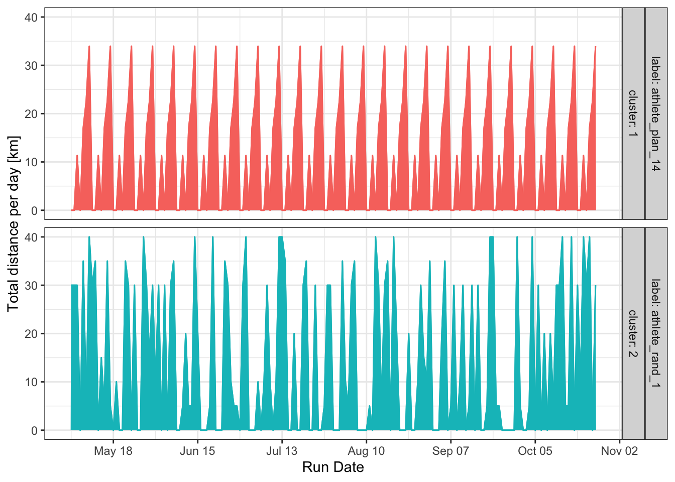
The main problem with raw data is noise. When trying to extract recurring patterns, random noise can sometimes create meaningless shapes that distort the cluster structure. Since we’re interested in classifying recurring patterns, removing this noise is a good idea. Signal processing offers many techniques for this, such as seasonality decomposition, Hidden Markov Models, and power spectrum analysis.
DTW cluster with seasonality decomposition
When it comes to time series analysis in R, certain packages and functions are indispensable. You likely can’t get far without zoo::zoo(), xts::xts(), or tibbletime::as_tbl_time(). However, the base {stats} package contains one of the most useful functions: stl(). This function performs a Seasonal Decomposition of Time Series by Loess, which is a powerful way to separate a time series into its trend, seasonal, and noise components. Here, we’ll use stl() to extract the weekly seasonality from each training plan and then cluster the results with DTW.
First, let’s apply the stl() decomposition to every time series in our list.
extract_seasonality <- function(x, robust) {
  x_ts <- ts(as.numeric(unlist(x)), frequency = 7)
  stl_test <- stl(x_ts, s.window = 7, robust)
  return(stl_test$time.series[, 1])
}
#
plan_seasonality <- plan_list %>%
  purrr::map(~ extract_seasonality(., robust = TRUE))
Next, we’ll process the model and plot the results.
Nclust <- 2
dtw_model <- dtwclust::tsclust(
  series = plan_seasonality,
  type = "h",
  k = Nclust,
  distance = "dtw_basic",
  control = hierarchical_control(method = "complete"),
  preproc = NULL,
  # args = tsclust_args(dist = list(window.size = 5L)),
  trace = TRUE
)
Calculating distance matrix...
Performing hierarchical clustering...
Extracting centroids...

    Elapsed time is 0.049 seconds.
#
dtw_data <- ggdendro::dendro_data(dtw_model, type = "rectangle")
#
labels_order <- dtw_data$labels$label
#
dtw_result <- data.frame(
label = names(plan_seasonality),
cluster = factor(stats::cutree(dtw_model, k = Nclust))
)
#
dtw_data[["labels"]] <- merge(dtw_data[["labels"]], dtw_result, by = "label")
dtw_result <- dplyr::full_join(dtw_result, dtw_data$labels, by = c("label", "cluster")) %>%
dplyr::arrange(x)cluster_box <- aggregate(x ~ cluster, ggdendro::label(dtw_data), range)
cluster_box <- data.frame(cluster_box$cluster, cluster_box$x)
cluster_threshold <- mean(dtw_model$height[length(dtw_model$height) - ((Nclust - 2):(Nclust - 1))])
#
numColors <- length(levels(dtw_result$cluster)) # How many colors you need
getColors <- scales::hue_pal() # Create a function that takes a number and returns a qualitative palette of that length (from the scales package)
myPalette <- getColors(numColors)
names(myPalette) <- levels(dtw_result$cluster) # Give every color an appropriate name
p1 <- ggplot() +
geom_rect(data = cluster_box, aes(xmin = X1 - .3, xmax = X2 + .3, ymin = 0, ymax = cluster_threshold, color = cluster_box.cluster), fill = NA) +
geom_segment(data = ggdendro::segment(dtw_data), aes(x = x, y = y, xend = xend, yend = yend)) +
coord_flip() +
scale_y_continuous("Distance") +
scale_x_continuous("", breaks = 1:20, labels = labels_order) +
guides(color = FALSE, fill = FALSE) +
theme(
panel.grid.major = element_blank(),
panel.grid.minor = element_blank(), # remove grids
panel.background = element_blank(),
axis.text.y = element_text(colour = myPalette[dtw_result$cluster], hjust = 0.5),
axis.ticks.y = element_blank()
)
#
p2 <- as.data.frame(matrix(unlist(plan_seasonality),
nrow = length(unlist(plan_seasonality[1])),
dimnames = list(c(), names(plan_seasonality))
)) %>%
dplyr::mutate(rundatelocal = seq.Date(date_marathon - 175, date_marathon - 1, by = "day")) %>%
tidyr::gather(key = label, value = value, -rundatelocal) %>%
dplyr::mutate(label = as.factor(label)) %>%
dplyr::full_join(., dtw_result, by = "label") %>%
mutate(label = factor(label, levels = rev(as.character(labels_order)))) %>%
ggplot(aes(x = rundatelocal, y = value, colour = as.factor(cluster))) +
geom_line() +
geom_area(aes(fill = as.factor(cluster))) +
coord_cartesian(ylim = c(-25, 25)) +
scale_y_continuous(name = "Seasonal distance per day [km]", breaks = seq(-25, 25, by = 50)) +
scale_x_date(name = "Run Date", date_breaks = "4 week", date_labels = "%b %d") +
facet_wrap(~label, ncol = 1, strip.position = "left") +
guides(color = FALSE, fill = FALSE) +
theme_bw() +
theme(strip.background = element_blank(), strip.text = element_blank())
#
plt_list <- list(p2, p1)
plt_layout <- rbind(
c(NA, 2),
c(1, 2),
c(NA, 2)
)
#
grid.arrange(grobs = plt_list, layout_matrix = plt_layout, heights = c(0.04, 1, 0.05))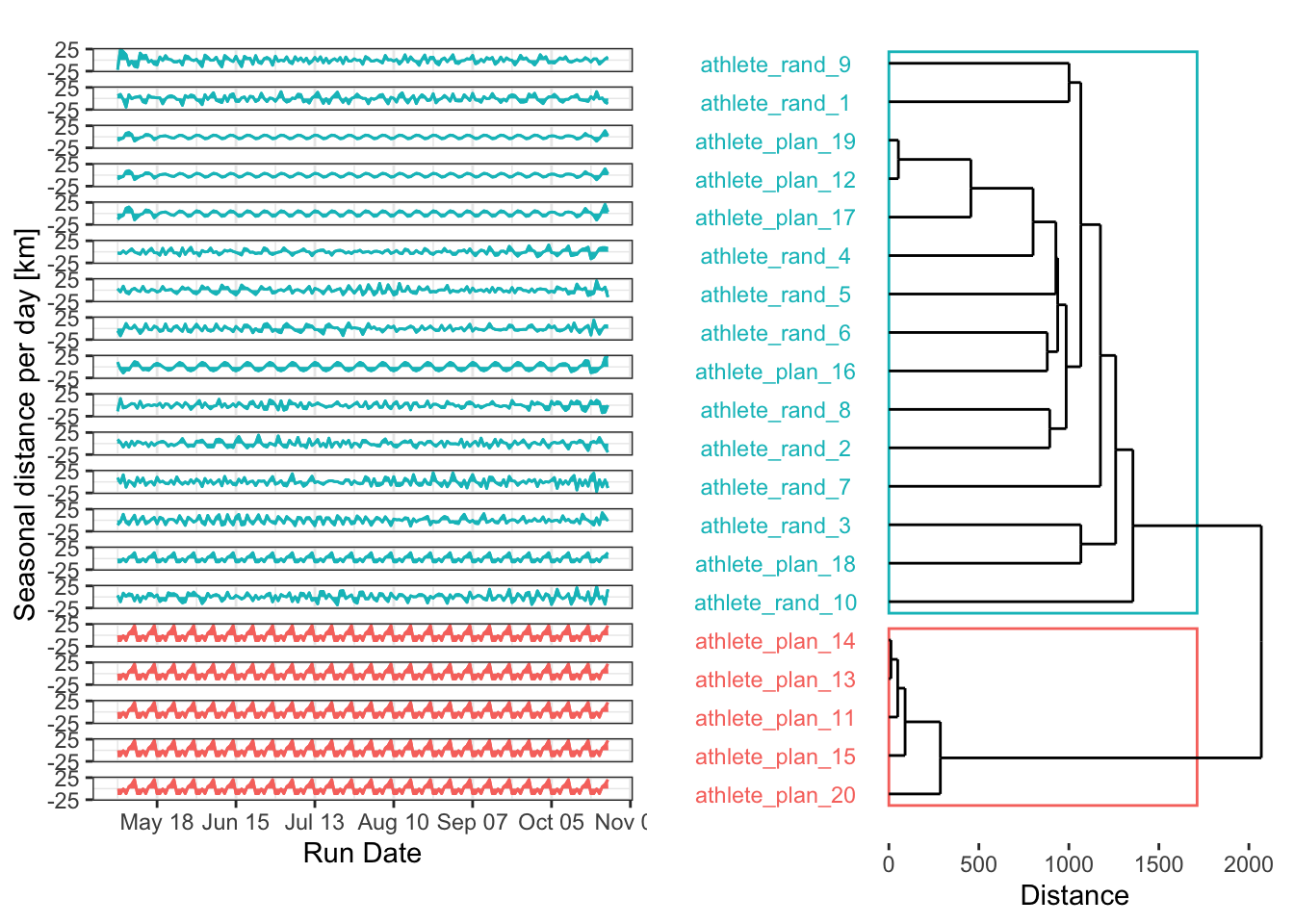
Well, I think that’s an epic fail. Let’s explore why. Several reasons could explain why we have one cluster with only 3 time series and another with the remaining 17:
- I’m only using two clusters. In reality (and with real randomness), many more patterns are possible. Increasing the number of clusters could make the clustering more effective, especially if combined with an evaluation of the optimal cluster count.
- By removing the noise from the random plans, I inadvertently made them less random, revealing underlying repetitive patterns. This is exactly what I want to do with real data in my research, but here, it just made a mess.
So, let’s try another method!
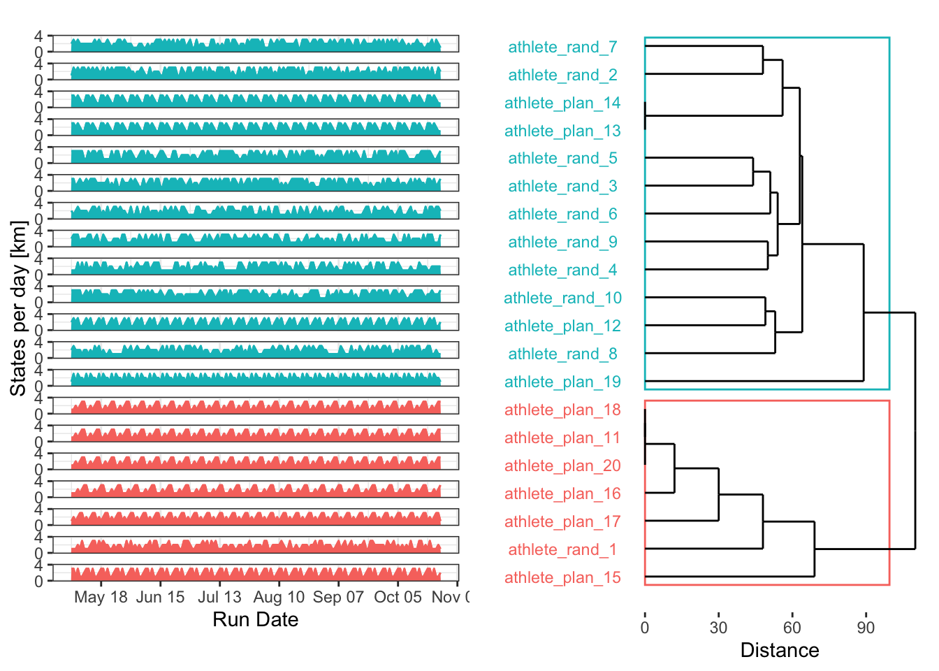
DTW cluster by power spectral density
Last but not least, perhaps the best approach for evaluating seasonality in training plans is power spectrum analysis. By identifying the underlying frequencies in each time series, we can cluster them according to their dominant patterns. The excellent {WaveletComp} package is perfect for this, as it analyses the frequency structure of time series using the Morlet wavelet.
Nclust <- 2
dtw_model <- dtwclust::tsclust(
  series = plan_poweravge,
  type = "h",
  k = Nclust,
  distance = "dtw_basic",
  control = hierarchical_control(method = "complete"),
  preproc = NULL,
  # args = tsclust_args(dist = list(window.size = 5L)),
  trace = TRUE
)
Calculating distance matrix...
Performing hierarchical clustering...
Extracting centroids...

    Elapsed time is 0.009 seconds.
#
dtw_data <- ggdendro::dendro_data(dtw_model, type = "rectangle")
#
labels_order <- dtw_data$labels$label
#
dtw_result <- data.frame(
label = names(plan_poweravge),
cluster = factor(stats::cutree(dtw_model, k = Nclust))
)
#
dtw_data[["labels"]] <- merge(dtw_data[["labels"]], dtw_result, by = "label")
dtw_result <- dplyr::full_join(dtw_result, dtw_data$labels, by = c("label", "cluster")) %>%
dplyr::arrange(x)cluster_box <- aggregate(x ~ cluster, ggdendro::label(dtw_data), range)
cluster_box <- data.frame(cluster_box$cluster, cluster_box$x)
cluster_threshold <- mean(dtw_model$height[length(dtw_model$height) - ((Nclust - 2):(Nclust - 1))])
#
numColors <- length(levels(dtw_result$cluster)) # How many colors you need
getColors <- scales::hue_pal() # Create a function that takes a number and returns a qualitative palette of that length (from the scales package)
myPalette <- getColors(numColors)
names(myPalette) <- levels(dtw_result$cluster) # Give every color an appropriate name
p1 <- ggplot() +
geom_rect(data = cluster_box, aes(xmin = X1 - .3, xmax = X2 + .3, ymin = 0, ymax = cluster_threshold, color = cluster_box.cluster), fill = NA) +
geom_segment(data = ggdendro::segment(dtw_data), aes(x = x, y = y, xend = xend, yend = yend)) +
coord_flip() +
scale_y_continuous("Distance") +
scale_x_continuous("", breaks = 1:20, labels = labels_order) +
guides(color = FALSE, fill = FALSE) +
theme(
panel.grid.major = element_blank(),
panel.grid.minor = element_blank(), # remove grids
panel.background = element_blank(),
axis.text.y = element_text(colour = myPalette[dtw_result$cluster], hjust = 0.5),
axis.ticks.y = element_blank()
)
#
p2 <- as.data.frame(matrix(unlist(plan_poweravge),
nrow = length(unlist(plan_poweravge[1])),
dimnames = list(c(), names(plan_poweravge))
)) %>%
dplyr::mutate(rundatelocal = 1:n()) %>%
tidyr::gather(key = label, value = value, -rundatelocal) %>%
dplyr::mutate(label = as.factor(label)) %>%
dplyr::full_join(., dtw_result, by = "label") %>%
mutate(label = factor(label, levels = rev(as.character(labels_order)))) %>%
ggplot(aes(x = rundatelocal, y = value, colour = as.factor(cluster))) +
geom_line() +
geom_area(aes(fill = as.factor(cluster))) +
coord_cartesian(ylim = c(0, 1)) +
scale_y_continuous(name = "Average power density", breaks = seq(0, 1, by = 1)) +
scale_x_continuous(name = "Period (days)") +
facet_wrap(~label, ncol = 1, strip.position = "left") +
guides(color = FALSE, fill = FALSE) +
theme_bw() +
theme(strip.background = element_blank(), strip.text = element_blank())
#
plt_list <- list(p2, p1)
plt_layout <- rbind(
c(NA, 2),
c(1, 2),
c(NA, 2)
)
#
grid.arrange(grobs = plt_list, layout_matrix = plt_layout, heights = c(0.04, 1, 0.05))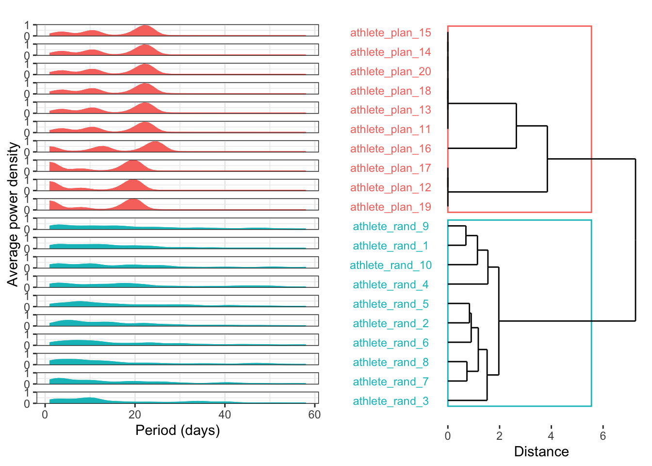
This frequency decomposition looks amazing! However, be careful: the power frequencies are averaged. As stated in the package’s guided tour, “[the] average power plot cannot distinguish between consecutive periods and overlapping periods.” This is a limitation, but using average power is definitely a great first step toward a robust classification of training plan patterns.