library(dplyr) # data wrangling
library(ggplot2) # grammar of graphics
library(gridExtra) # merge plots
library(ggdendro) # dendrograms
library(gplots) # heatmap
library(tseries) # bootstrap
library(TSclust) # cluster time series
library(dtwclust) # cluster time series with dynamic time warpingTime series Clustering with Dynamic Time Warping
If you want to cluster time series in R, you’re in luck. There are many available solutions, and the web is packed with helpful tutorials like those from Thomas Girke, Rafael Irizarry and Michael Love, Andrew B. Collier, Peter Laurinec, Dylan Glotzer, and Ana Rita Marques.
Dynamic Time Warping (DTW) is one of the most popular solutions. Its primary strength is that it can group time series by shape, even when their patterns are out of sync or lagged.
From what I’ve seen, {TSclust} by Pablo Montero Manso and José Antonio Vilar and {dtwclust} by Alexis Sarda-Espinosa are the two go-to packages for this task. They’re both simple and powerful, but understanding how they work on real data can be tricky. To demystify the process, I’ll simulate two distinct groups of time series and see if DTW clustering can tell them apart.
List of packages needed
Data simulation
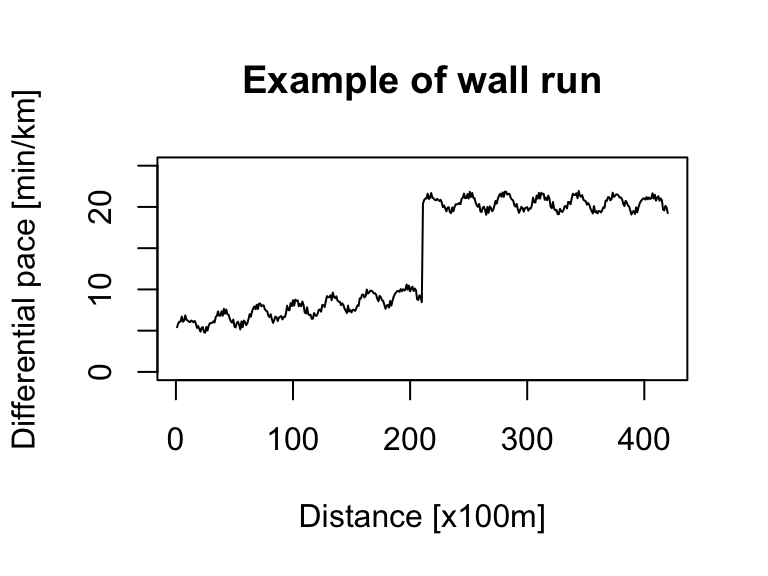
Let’s simulate marathon data for two types of runners. The first represents a ‘classic’ run where the pace steadily increases. The second represents a runner ‘hitting the wall,’ which we’ll model as a sudden jump in pace (a significant slowdown) during the race’s second half. While real data is always preferable, simulating these patterns is a great way to test our clustering method’s effectiveness.
We can create a basic simulation using a sine() function with some added random noise for realism.
# classic run
noise <- runif(420) # random noise
x <- seq(1, 420) # 42km with a measure every 100m
pace_min <- 5 # min/km (corresponds to fast run)

ts_sim_classic_run <- (sin(x / 10) + x / 100 + noise + pace_min) %>%
  as.ts(.)

ts.plot(ts_sim_classic_run, xlab = "Distance [x100m]", ylab = "Differential pace [min/km]", main = "Example of classic run", ylim = c(0, 25))

# wall run
noise <- runif(210) # random noise
x <- seq(1, 210) # 21km with a measure every 100m
pace_min <- 5 # min/km (corresponds to fast run)
pace_wall <- 20 # min/km (corresponds to very slow run)
ts_sim_part1 <- sin(x / 5) + x / 50 + noise + pace_min
ts_sim_part2 <- sin(x / 5) + noise + pace_wall

ts_sim_wall_run <- c(ts_sim_part1, ts_sim_part2) %>%
  as.ts(.)

ts.plot(ts_sim_wall_run, xlab = "Distance [x100m]", ylab = "Differential pace [min/km]", main = "Example of wall run", ylim = c(0, 25))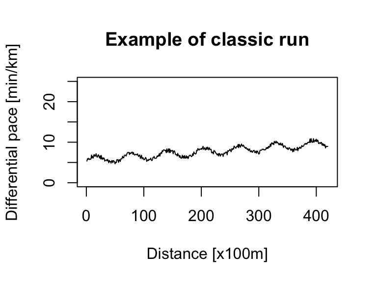
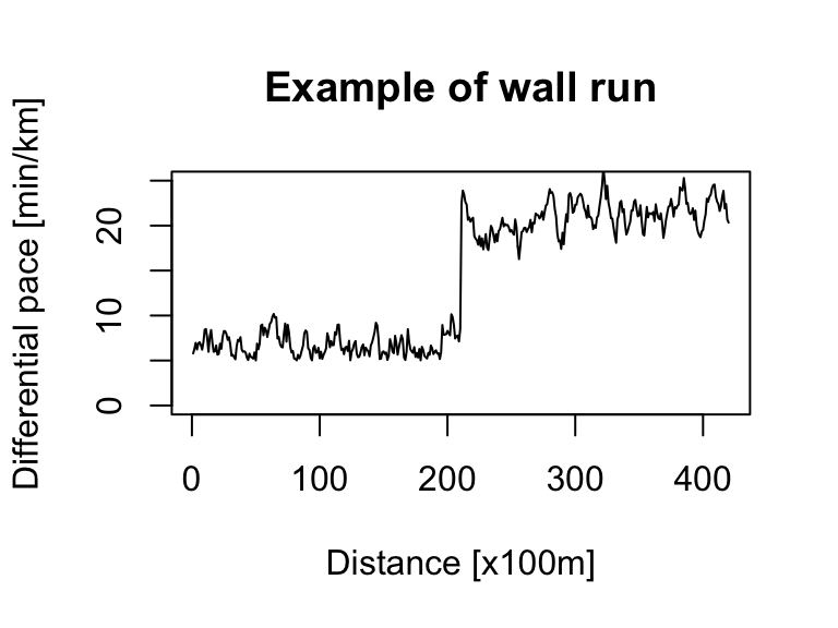
For a more sophisticated simulation, we can use an ARIMA model, specifically its autoregressive (AR) component.
pace_min <- 5 # min/km (corresponds to fast run)
pace_wall <- 20 # min/km (corresponds to very slow run)

# classic run
ts_sim_classic_run <- abs(arima.sim(n = 420, mean = 0.001, model = list(order = c(1, 0, 0), ar = 0.9))) + pace_min

ts.plot(ts_sim_classic_run, xlab = "Distance [x100m]", ylab = "Differential pace [min/km]", main = "Example of classic run", ylim = c(0, 25))

# wall run
ts_sim_part1 <- abs(arima.sim(n = 210, model = list(order = c(1, 0, 0), ar = 0.9))) + pace_min
ts_sim_part2 <- ts(arima.sim(n = 210, model = list(order = c(1, 0, 0), ar = 0.9)) + pace_wall, start = 211, end = 420)

ts_sim_wall_run <- ts.union(ts_sim_part1, ts_sim_part2)
ts_sim_wall_run <- pmin(ts_sim_wall_run[, 1], ts_sim_wall_run[, 2], na.rm = TRUE)

ts.plot(ts_sim_wall_run, xlab = "Distance [x100m]", ylab = "Differential pace [min/km]", main = "Example of wall run", ylim = c(0, 25))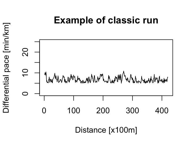
Bootstrap
With our two base profiles created, we’ll now bootstrap them. This process replicates the profiles with slight variations, giving us two groups with five time series each.
ts_sim_boot_classic <- ts_sim_classic_run %>%
  tseries::tsbootstrap(., nb = 5, b = 200, type = "block") %>%
  as.data.frame(.) %>%
  dplyr::rename_all(funs(c(paste0("classic_", .))))

ts_sim_boot_wall <- ts_sim_wall_run %>%
  tseries::tsbootstrap(., nb = 5, b = 350, type = "block") %>%
  as.data.frame(.) %>%
  dplyr::rename_all(funs(c(paste0("wall_", .))))

ts_sim_df <- cbind(ts_sim_boot_classic, ts_sim_boot_wall)
Heatmap cluster
{ggplot2} is fantastic, but for a quick and efficient heatmap, other packages are sometimes better. I’ll use {gplots} here, as it can generate a heatmap with dendrograms using a single function. You can find a complete guide to R heatmaps here.
dtw_dist <- function(x) {
  dist(x, method = "DTW")
}

ts_sim_df %>%
  as.matrix() %>%
  gplots::heatmap.2(
    # dendrogram control
    distfun = dtw_dist,
    hclustfun = hclust,
    dendrogram = "column",
    Rowv = FALSE,
    labRow = FALSE
  )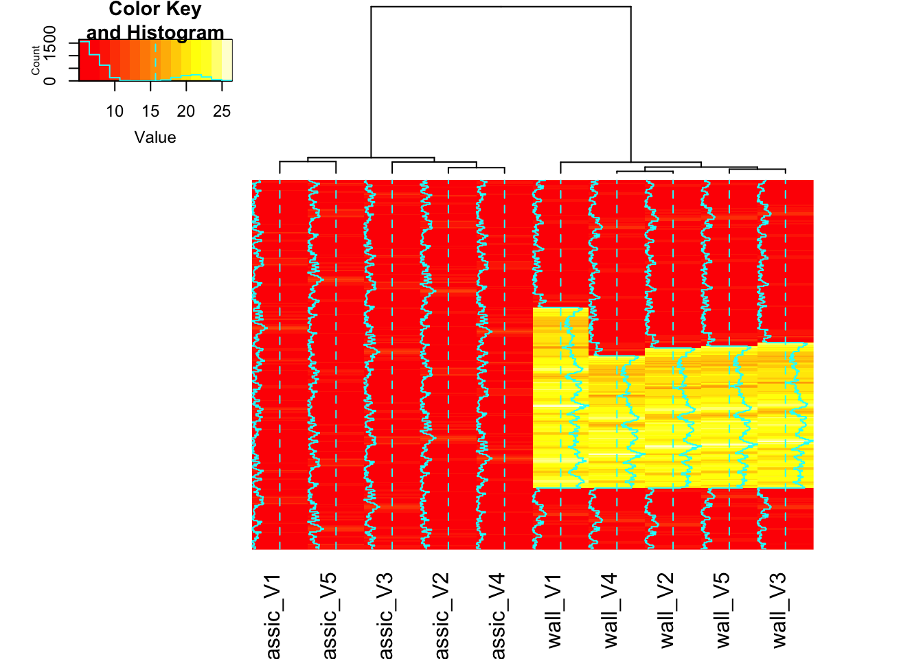
The heatmap already shows a clear separation between the ‘classic’ and ‘wall’ runs. But since our focus is on DTW, let’s move on to the {TSclust} and {dtwclust} packages.
DTW cluster
The workflow for both {TSclust} and {dtwclust} involves the same general steps:
- Compute a dissimilarity matrix for all time series pairs using a distance metric like DTW (as described by Montero & Vilar, 2014).
- Apply hierarchical clustering to the dissimilarity matrix.
- Generate a dendrogram to visualize the cluster results. The technique for plotting the time series next to the dendrogram comes from Ian Hansel’s blog.
Using {TSclust}
# cluster analysis
dist_ts <- TSclust::diss(SERIES = t(ts_sim_df), METHOD = "DTWARP") # note the dataframe must be transposed
hc <- stats::hclust(dist_ts, method = "complete") # meathod can be also "average" or diana (for DIvisive ANAlysis Clustering)
# k for cluster which is 2 in our case (classic vs. wall)
hclus <- stats::cutree(hc, k = 2) %>% # hclus <- cluster::pam(dist_ts, k = 2)$clustering has a similar result
  as.data.frame(.) %>%
  dplyr::rename(., cluster_group = .) %>%
  tibble::rownames_to_column("type_col")

hcdata <- ggdendro::dendro_data(hc)
names_order <- hcdata$labels$label
# Use the folloing to remove labels from dendogram so not doubling up - but good for checking hcdata$labels$label <- ""

p1 <- hcdata %>%
  ggdendro::ggdendrogram(., rotate = TRUE, leaf_labels = FALSE)

p2 <- ts_sim_df %>%
  dplyr::mutate(index = 1:420) %>%
  tidyr::gather(key = type_col, value = value, -index) %>%
  dplyr::full_join(., hclus, by = "type_col") %>%
  mutate(type_col = factor(type_col, levels = rev(as.character(names_order)))) %>%
  ggplot(aes(x = index, y = value, colour = cluster_group)) +
  geom_line() +
  facet_wrap(~type_col, ncol = 1, strip.position = "left") +
  guides(color = FALSE) +
  theme_bw() +
  theme(strip.background = element_blank(), strip.text = element_blank())

gp1 <- ggplotGrob(p1)
gp2 <- ggplotGrob(p2)

grid.arrange(gp2, gp1, ncol = 2, widths = c(4, 2))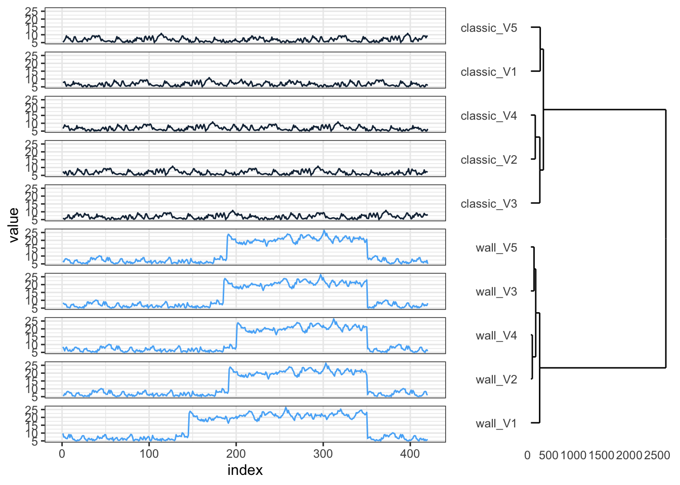
{TSclust} successfully separates the time series into two groups as expected. Looking closer, however, the ‘wall’ runs within their cluster aren’t perfectly ordered by shape. Let’s see if {dtwclust} performs better.
Using {dtwclust}
The standout feature of {dtwclust} is its high level of customization for the clustering process. The package vignette provides a comprehensive look at all the available options.
cluster_dtw_h2 <- dtwclust::tsclust(t(ts_sim_df),
  type = "h",
  k = 2,
  distance = "dtw",
  control = hierarchical_control(method = "complete"),
  preproc = NULL,
  args = tsclust_args(dist = list(window.size = 5L))
)

hclus <- stats::cutree(cluster_dtw_h2, k = 2) %>% # hclus <- cluster::pam(dist_ts, k = 2)$clustering has a similar result
  as.data.frame(.) %>%
  dplyr::rename(., cluster_group = .) %>%
  tibble::rownames_to_column("type_col")

hcdata <- ggdendro::dendro_data(cluster_dtw_h2)
names_order <- hcdata$labels$label
# Use the folloing to remove labels from dendogram so not doubling up - but good for checking hcdata$labels$label <- ""

p1 <- hcdata %>%
  ggdendro::ggdendrogram(., rotate = TRUE, leaf_labels = FALSE)

p2 <- ts_sim_df %>%
  dplyr::mutate(index = 1:420) %>%
  tidyr::gather(key = type_col, value = value, -index) %>%
  dplyr::full_join(., hclus, by = "type_col") %>%
  mutate(type_col = factor(type_col, levels = rev(as.character(names_order)))) %>%
  ggplot(aes(x = index, y = value, colour = cluster_group)) +
  geom_line() +
  facet_wrap(~type_col, ncol = 1, strip.position = "left") +
  guides(color = FALSE) +
  theme_bw() +
  theme(strip.background = element_blank(), strip.text = element_blank())

gp1 <- ggplotGrob(p1)
gp2 <- ggplotGrob(p2)

grid.arrange(gp2, gp1, ncol = 2, widths = c(4, 2))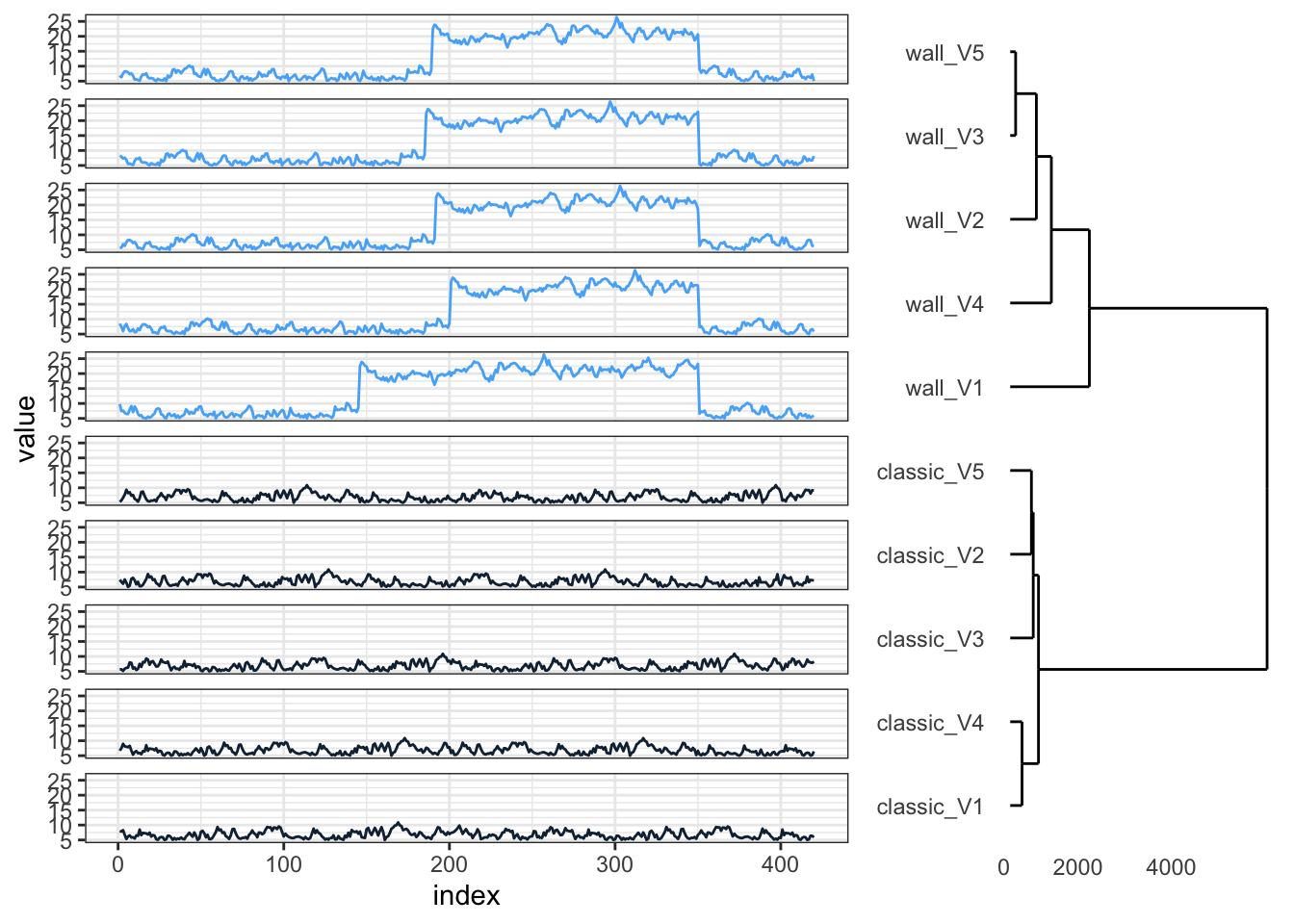
This result is better. The clusters correctly separate the ‘classic’ and ‘wall’ runs, and now, time series with similar shapes are also grouped together within each cluster.
We can refine this further by modifying the arguments to cluster based on z-scores and calculate centroids using the built-in shape_extraction() function.
cluster_dtw_h2 <- dtwclust::tsclust(t(ts_sim_df),
  type = "h", k = 2L,
  preproc = zscore,
  distance = "dtw", centroid = shape_extraction,
  control = hierarchical_control(method = "complete")
)

hclus <- stats::cutree(cluster_dtw_h2, k = 2) %>% # hclus <- cluster::pam(dist_ts, k = 2)$clustering has a similar result
  as.data.frame(.) %>%
  dplyr::rename(., cluster_group = .) %>%
  tibble::rownames_to_column("type_col")

hcdata <- ggdendro::dendro_data(cluster_dtw_h2)
names_order <- hcdata$labels$label
# Use the folloing to remove labels from dendogram so not doubling up - but good for checking hcdata$labels$label <- ""

p1 <- hcdata %>%
  ggdendro::ggdendrogram(., rotate = TRUE, leaf_labels = FALSE)

p2 <- ts_sim_df %>%
  dplyr::mutate(index = 1:420) %>%
  tidyr::gather(key = type_col, value = value, -index) %>%
  dplyr::full_join(., hclus, by = "type_col") %>%
  mutate(type_col = factor(type_col, levels = rev(as.character(names_order)))) %>%
  ggplot(aes(x = index, y = value, colour = cluster_group)) +
  geom_line() +
  facet_wrap(~type_col, ncol = 1, strip.position = "left") +
  guides(color = FALSE) +
  theme_bw() +
  theme(strip.background = element_blank(), strip.text = element_blank())

gp1 <- ggplotGrob(p1)
gp2 <- ggplotGrob(p2)

grid.arrange(gp2, gp1, ncol = 2, widths = c(4, 2))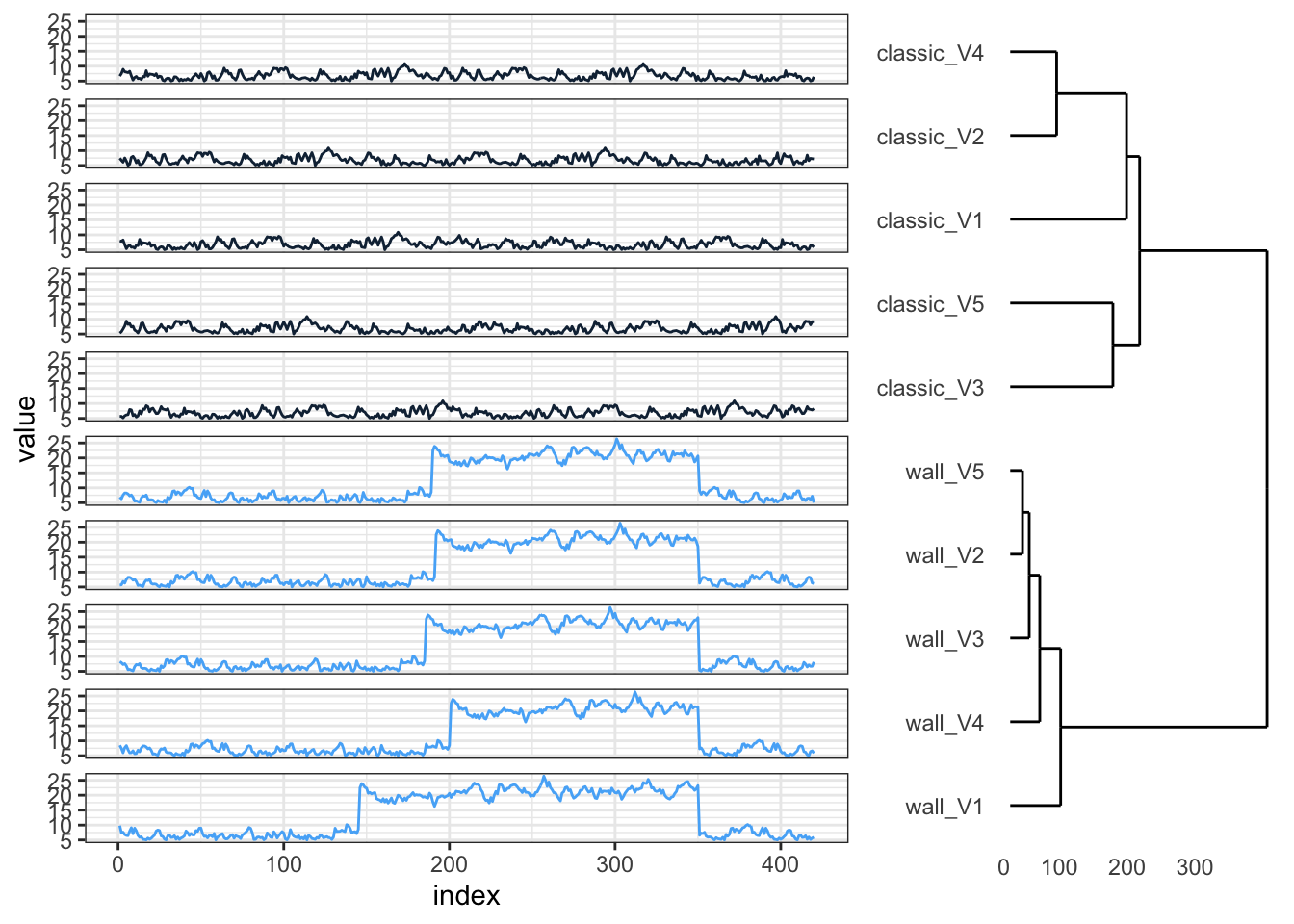
As shown in the vignette, we can also register a custom function for a normalized and asymmetric variant of DTW.
# Normalized DTW
ndtw <- function(x, y, ...) {
  dtw(x, y, ...,
    step.pattern = asymmetric,
    distance.only = TRUE
  )$normalizedDistance
}
# Register the distance with proxy
proxy::pr_DB$set_entry(
  FUN = ndtw, names = c("nDTW"),
  loop = TRUE, type = "metric", distance = TRUE,
  description = "Normalized, asymmetric DTW"
)
# Partitional clustering
cluster_dtw_h2 <- dtwclust::tsclust(t(ts_sim_df), k = 2L, distance = "nDTW")

plot(cluster_dtw_h2)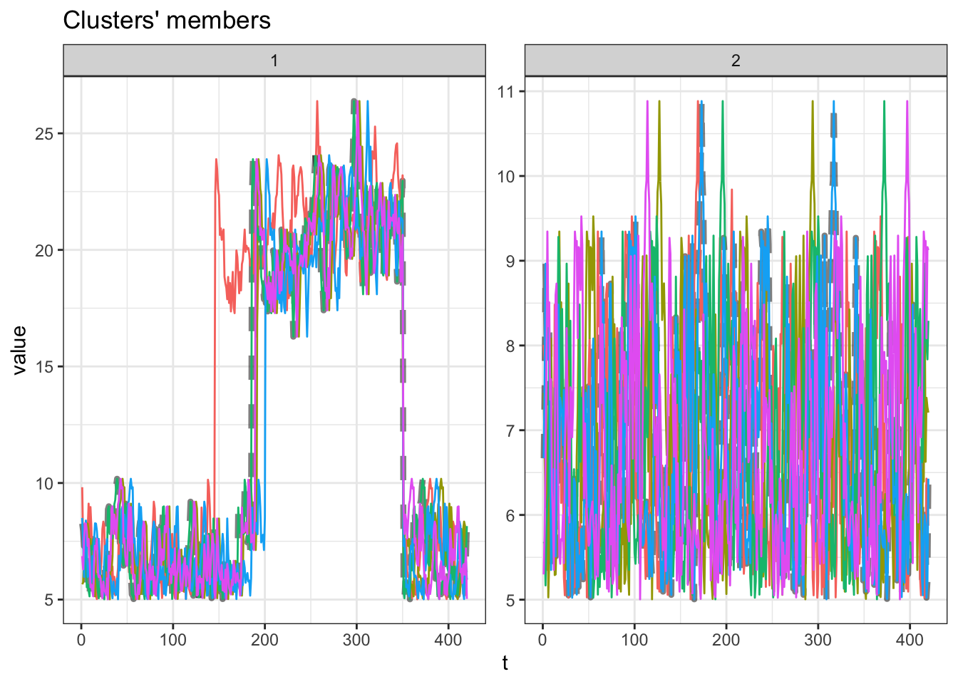
While this partitional approach works well for the sine data, it’s less accurate for our ARIMA-based simulations. A drawback of this method is that I can’t extract a dendrogram from the cluster_dtw_h2 object directly, but the distance matrix it contains could still be useful.
This initial analysis shows the promise of DTW. To continue this work, future steps would involve testing the method on time series with greater dissimilarities and, most importantly, applying it to a real-world dataset.