class: center, middle, inverse, title-slide .title[ # BAA1030 - Data Analytics and Story Telling ] .subtitle[ ## Lecture 9: Introduction to Quarto ] .author[ ### Damien Dupré ] .date[ ### Dublin City University ] --- # Objectives In this lecture, with Google Colab, we will see how to create an **html** file from a python notebook to embed text and code output and generate professional outputs. -- #### Where can I find more resources? - [Official Quarto Website](https://quarto.org/) - [Literate Programming With Jupyter Notebooks and Quarto](https://www.youtube.com/watch?v=C8kDPmb_IKU) - [Appsilon](https://appsilon.com/r-quarto-tutorial/) - [Making shareable documents with Quarto](https://openscapes.github.io/quarto-website-tutorial/) - [Quarto 2hr webinar](https://jthomasmock.github.io/quarto-2hr-webinar) --- # Sharing a Notebook .pull-left[ Usually, `.ipynb` files can be sent by email to your boss. Similarly, when working with Google Colab, it is possible to share the [link to your notebook from your Google Drive](https://www.geeksforgeeks.org/sharing-notebook-in-google-colab/). ] .pull-right[ <!-- --> ] However only the content mixes code chunks, messages, and the output. Plus, if your boss does not have access to your data, they won't be able to reproduce or just see your results. --- # Sharing a Notebook  --- # Sharing a Notebook  --- # What is Quarto? Quarto is an open-source scientific and technical publishing system that builds on standard markdown with features essential for scientific communication. - Computations: Python, R, Julia, Observable JS - Markdown: Pandoc flavored markdown with many enhancements - Output: Documents, presentations, websites, books, blogs See https://quarto.org for more details -- The Goal is to create a document that is all-in-one - Documents that include source code for their production - Notebook AND plain-text flavors - Programmatic automation and reproducibility --- # Two Sides of Quarto Files .pull-left[ ### On the editor side... - Write text in markdown - Insert code using R or Python - Write "metadata" with YAML ] .pull-right[ ### On the output side... - Output to HTML - Output to PDF - Output to Word - Many other variations too ] Try it by yourself! --- # Using Quarto with Google Colab Quarto must be used from a Terminal! This is straightforward when you are using your own computer but it is tricky when using Google Colab. <img src="https://raw.githubusercontent.com/damien-dupre/img/main/colab_terminal.png" width="60%" /> --- # Using Quarto with Google Colab First, you need to install quarto from the terminal with a bash command: ```{.bash} pip install quarto-cli ``` Second, you need to grant access to Quarto to send the output to your Google Drive. To grant this access, just run the following code in the notebook or click `Mount Drive` to connect your Google Drive to your Google Colab: ```{.python} from google.colab import drive drive.mount("/content/drive") ``` --- # Using Quarto with Google Colab Once Quarto is installed, convert the `.ipynb` notebook to html with the following command in the Terminal: ```{.bash} quarto render "/content/drive/MyDrive/Colab Notebooks/report.ipynb" ``` If you obtain the following output: ``` line 1: quarto: command not found ``` Then you need to run `pip install quarto-cli` again in the terminal! --- class: title-slide, middle ## 🛠️ Your Turn! 1/ Create a notebook called `report.ipynb` and run the following code in the first cell: ```{.python} from google.colab import drive drive.mount("/content/drive") ``` 2/ add a second code cell: ```{.python} print("Hello Quarto") ``` 3/ From the Terminal, install Quarto: ```{.bash} pip install quarto-cli ``` 4/ From the Terminal, convert your document to HTML: ```{.bash} quarto render "/content/drive/MyDrive/Colab Notebooks/report.ipynb" ``` <div class="countdown" id="timer_e3521927" data-warn-when="60" data-update-every="1" tabindex="0" style="top:0;right:0;"> <div class="countdown-controls"><button class="countdown-bump-down">−</button><button class="countdown-bump-up">+</button></div> <code class="countdown-time"><span class="countdown-digits minutes">05</span><span class="countdown-digits colon">:</span><span class="countdown-digits seconds">00</span></code> </div> --- # Converting ipynb to html Quarto, by default, creates an html webpage from an `.ipynb` notebook with the command `quarto render`. Contrary to an `.ipynb` document which is a working document, an `.html` document is a final output which has a lot of possibilities such as displaying figures and texts, as well as dashboards too. The important thing to remember is that your code cells have to be already run before the `.html` is created to include their results in the html file. If your code contains images and visualisations, then a supporting folder called `report_files` will also be created and will be necessary to display the html output of your report. However, we will see later a way to include this supporting folder inside the html output itself. --- # Converting ipynb to html Once Quarto is installed from the terminal, and the access to your google drive is granted from the terminal, you can add as many cells as you want and re-render your document using again: ```{.bash} quarto render "/content/drive/MyDrive/Colab Notebooks/report.ipynb" ``` In the terminal, you can reuse an already processed code by pressing the down arrow key ⬇️ --- class: title-slide, middle ## 🛠️ Your Turn! 1/ Add another code cell with the following code and run it to display the visualisation: ```{.python} import polars as pl from plotnine import * (pl.DataFrame({ "Knowledge": ["Without Python", "With Python"], "Power": [0.5, 99.5] }) >> ggplot(aes(x="Knowledge", y="Power")) + geom_col() + theme_minimal() ) ``` 2/ From the terminal, render the document again: ```{.bash} quarto render "/content/drive/MyDrive/Colab Notebooks/report.ipynb" ``` Note: use the down arrow key ⬇️ <div class="countdown" id="timer_685613c5" data-warn-when="60" data-update-every="1" tabindex="0" style="top:0;right:0;"> <div class="countdown-controls"><button class="countdown-bump-down">−</button><button class="countdown-bump-up">+</button></div> <code class="countdown-time"><span class="countdown-digits minutes">02</span><span class="countdown-digits colon">:</span><span class="countdown-digits seconds">00</span></code> </div> --- class: inverse, mline, center, middle # Markdown Text in Python Notebooks --- # Markdown Text in Python Notebooks So far, we only have seen code cells. A second option of Google Colab is to include text cells. These text cells are the ones you will use to tell your story. You can manually modify the style of the text like with a text editor (i.e., MS Word), but these are markdown text cells and you can have even more fun! <img src="https://media2.dev.to/dynamic/image/width=1000,height=420,fit=cover,gravity=auto,format=auto/https%3A%2F%2Fdev-to-uploads.s3.amazonaws.com%2Fuploads%2Farticles%2Fu03nos2wpt1psgysad6p.png" width="80%" /> --- # Overview Markdown is a plain text format that is designed to be easy to write, and, even more importantly, easy to read: > A Markdown-formatted document should be publishable as-is, as plain text, without looking like it's been marked up with tags or formatting instructions. -- [John Gruber](https://daringfireball.net/projects/markdown/syntax#philosophy) This document provides examples of the most commonly used markdown syntax. See the full documentation of [Markdown](https://pandoc.org/MANUAL.html#pandocs-markdown) for more in-depth documentation. --- # Emphasising Text -- .pull-left[ <br><br> ### What you type... <br> ``` this is *italics* this is **bold** this is ***bold italics*** ``` ] -- .pull-right[ <br><br> ### What you get... <br> this is *italics* this is **bold** this is ***bold italics*** ] --- # Creating Lists -- .pull-left[ <br><br> ### What you type... <br> ``` - unnumbered lists - look like this 1. numbered lists 2. look like this ``` ] -- .pull-right[ <br><br> ### What you get... <br> - unnumbered lists - look like this 1. numbered lists 2. look like this ] --- # Creating Headings -- .pull-left[ <br><br> ### What you type... <br> ``` # Level 1 heading ## Level 2 heading ### Level 3 heading ``` ] -- .pull-right[ <br><br> ### What you get... <br> ## Level 1 heading ### Level 2 heading #### Level 3 heading ] --- # Links -- .pull-left[ <br><br> ### What you type... <br> ```markdown <https://quarto.org> [Quarto](https://quarto.org) ``` ] -- .pull-right[ <br><br> ### What you get... <br> <https://quarto.org> <br><br> [Quarto](https://quarto.org) ] --- # Divisions -- .pull-left[ <br><br> ### What you type... <br> ``` markdown ::: {} 1. A list ::: ::: {} 1. Followed by another list ::: ``` ] -- .pull-right[ <br><br> ### What you get... <br> #### 1. A list <br><br> #### 1. Followed by another list ] --- # Divs Divs start with a fence containing at least three consecutive colons plus some attributes. The Div ends with another line containing a string of at least three consecutive colons. The Div should be separated by blank lines from preceding and following blocks. .pull-left[ <br><br> Divs may also be nested. For example: ``` markdown ::::: {#special .sidebar} ::: {.warning} Here is a warning. ::: More content. ::::: ``` ] .pull-right[ <br><br> Once rendered to HTML, Quarto will translate the markdown into: ``` html <div id="special" class="sidebar"> <div class="warning"> <p>Here is a warning.</p> </div> <p>More content.</p> </div> ``` ] --- # Callout Blocks ``` markdown :::{.callout-note} Note that there are five types of callouts, including: `note`, `tip`, `warning`, `caution`, and `important`. ::: ``` Learn more in the article on [Callout Blocks](https://quarto.org/docs/authoring/callouts.html). <!-- --> --- class: title-slide, middle ## 🛠️ Your Turn! 1/ In Google Colab, with the `report.ipynb` file that you have previously created, add a text cell with some *Lorem Ipsum* text and modify it with markdown. Try to: - Add a **heading** using `#` - Make some words **bold** and some *italic* - Create a **numbered list** with at least 3 items > Lorem ipsum dolor sit amet, consectetur adipiscing elit, sed do eiusmod tempor incididunt ut labore et dolore magna aliqua. Ut enim ad minim veniam, quis nostrud exercitation ullamco laboris nisi ut aliquip ex ea commodo consequat. 2/ From the Terminal, render your document again: ```{.bash} quarto render "/content/drive/MyDrive/Colab Notebooks/report.ipynb" ``` 3/ Download the html file `report.html` from Google Drive to your computer and open it. <div class="countdown" id="timer_171bd27f" data-warn-when="60" data-update-every="1" tabindex="0" style="top:0;right:0;"> <div class="countdown-controls"><button class="countdown-bump-down">−</button><button class="countdown-bump-up">+</button></div> <code class="countdown-time"><span class="countdown-digits minutes">05</span><span class="countdown-digits colon">:</span><span class="countdown-digits seconds">00</span></code> </div> --- class: inverse, mline, center, middle # Modifying the Design of the Output --- # Anatomy of a Code Chunk Until now, a code chunk was made of python code and, optionally, some comments: ```{.python} (ggplot(gapminder) # data layer + aes("pop", "lifeExp") # aesthetic layer + geom_point() # geometry layer ) ``` With Quarto, you can add output options with a `#|` (hashpipe): `#| option1: value` For example ```{.python} #| echo: false (ggplot(gapminder) + aes("pop", "lifeExp") + geom_point() ) ``` `#| echo: false` means only the output of the code is included in the report, not the code itself. --- # Code Chunk Options Chunk output can be customized with hashpipe options (i.e., arguments set after the `#|`). - `#| echo: true` will display the code and the results in the finished file (it overwrites `echo: false`) See the **[Quarto Reference Guide](https://quarto.org/docs/reference/cells/cells-knitr.html)** for a complete list of chunk options. --- # Visualisation Specific Options Some chunk options are specific to visualisations outputs: - fig-cap: "caption of the figure" - fig-height: 5 - fig-width: 5 Note, the default unit for height and width is inches. ```{.python} #| fig-cap: "caption of the figure" #| fig-height: 5 #| fig-width: 5 (ggplot(gapminder) + aes("pop", "lifeExp") + geom_point() ) ``` --- class: title-slide, middle ## Live Demo --- # YAML Text Cell Instead of modifying each Code Cell separately (e.g. to hide the code from each cell), general options can be set in a specific text cell at the beginning of the document called YAML. YAML starts and ends with `---`. Its main purpose is to define the type of output: ``` --- format: html --- ``` ``` --- format: pdf --- ``` ``` --- format: doc --- ``` However, by default it is `html` and this is what we want. --- # YAML Text Cell Additional elements can be added to the YAML to make the output document nicer ``` --- title: "My First Quarto Document" date: "2000-01-01" format: html --- ``` or ``` --- title: "My First Quarto Document" subtitle: "My Subtitle" author: "Damien Dupre" date: "2000-01-01" format: html --- ``` --- # YAML Text Cell -- .pull-left[ <br><br> ### What you type... <!-- --> ] -- .pull-right[ <br><br> ### What you get... 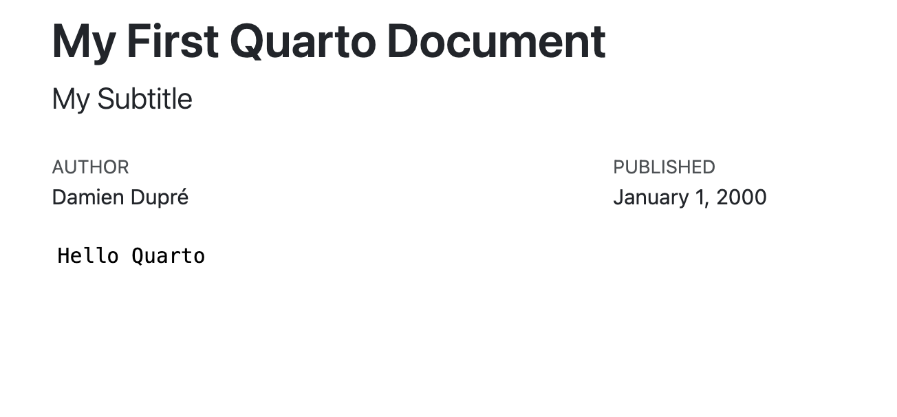<!-- --> ] --- # YAML Text Cell Quarto also sets code options with `execute:` in YAML: ```yaml --- format: html execute: warning: false message: false --- ``` Warning, the indentation is extremely important. If a line in the YAML ends with `:` then the next line has 1 TAB of indentation. --- # Mandatory YAML in Assignment 2 Including a YAML is mandatory for the Assignment 2 especially to include 2 lines: .pull-left[ ### 1. `embed-resources: true` One option of the html output is to integrate the annoying additional _file folder inside the html file itself. ] .pull-right[ ```yaml --- format: html: embed-resources: true execute: warning: false message: false --- ``` ] .pull-left[ ### 2. `code-fold: true` To assess your code, I need to see your code. Embed the code in a very smart way with `code-fold: true` ] .pull-right[ ```yaml --- format: html: embed-resources: true code-fold: true execute: warning: false message: false --- ``` ] --- # HTML Theming HTML documents rendered with Quarto use Bootstrap 5 by default. This can be disabled or customized via the `theme` option. Quarto includes 25 themes from the [Bootswatch](https://bootswatch.com/) project. Available themes include: [default](https://bootswatch.com/default/), [cerulean](https://bootswatch.com/cerulean/), [cosmo](https://bootswatch.com/cosmo/), [cyborg](https://bootswatch.com/cyborg/), [darkly](https://bootswatch.com/darkly/), [flatly](https://bootswatch.com/flatly/), [journal](https://bootswatch.com/journal/), [litera](https://bootswatch.com/litera/), [lumen](https://bootswatch.com/lumen/), [lux](https://bootswatch.com/lux/), [materia](https://bootswatch.com/materia/), [minty](https://bootswatch.com/minty/), [morph](https://bootswatch.com/morph/), [pulse](https://bootswatch.com/pulse/), [quartz](https://bootswatch.com/quartz/), [sandstone](https://bootswatch.com/sandstone/), [simplex](https://bootswatch.com/simplex/), [sketchy](https://bootswatch.com/sketchy/), [slate](https://bootswatch.com/slate/), [solar](https://bootswatch.com/solar/), [spacelab](https://bootswatch.com/spacelab/), [superhero](https://bootswatch.com/superhero/), [united](https://bootswatch.com/united/), [vapor](https://bootswatch.com/vapor/), [yeti](https://bootswatch.com/yeti/), [zephyr](https://bootswatch.com/zephyr/) Use any of these themes via the `theme` option. For example: ``` yaml --- format: html: theme: united embed-resources: true code-fold: true --- ``` --- # HTML Theming If you are using a Bootstrap theme, there are a set of options you can provide in document metadata to customize its appearance. These include: | Option | Description | |--------------------------------------------------------------|----------------------------------------------------------------------------------------------------------------------------------------------------------------| | `max-width` | The maximum width occupied by page content. Defaults to 1400px for bootstrap themes. | | `mainfont` | Sets the [`font-family`](https://developer.mozilla.org/en-US/docs/Web/CSS/font-family) property for the document. | | `fontsize` | Sets the base CSS [`font-size`](https://developer.mozilla.org/en-US/docs/Web/CSS/font-size) for the document. | | `fontcolor` | Sets the default text [`color`](https://developer.mozilla.org/en-US/docs/Web/CSS/color) for the document. | | `linkcolor` | Sets the default text [`color`](https://developer.mozilla.org/en-US/docs/Web/CSS/color) for hyperlinks. | | `monofont` | Sets the [`font-family`](https://developer.mozilla.org/en-US/docs/Web/CSS/font-family) property for `<code>` elements. | | `monobackgroundcolor` | Sets the [`background-color`](https://developer.mozilla.org/en-US/docs/Web/CSS/background-color) property for `<code>` elements. | | `linestretch` | Sets the CSS [`line-height`](https://developer.mozilla.org/en-US/docs/Web/CSS/line-height) property (affects distance between lines of text, defaults to 1.5). | | `backgroundcolor` | Sets the [`background-color`](https://developer.mozilla.org/en-US/docs/Web/CSS/background-color) for the document. | --- # HTML Theming For example, here we set the font-size a bit larger and specify that we want a bit more space between lines of text: ``` yaml --- title: "My Document" format: html: theme: cosmo fontsize: 1.1em linestretch: 1.7 embed-resources: true code-fold: true --- ``` Check out the official Quarto Website for more information about [HTML themes and output](https://quarto.org/docs/output-formats/html-themes.html) --- class: title-slide, middle ## 🛠️ Your Turn! 1/ In the `report.ipynb` notebook: .pull-left[ - Add a YAML ``` yaml --- title: "Your Report Title" author: "Your Name" format: html: embed-resources: true code-fold: true --- ``` ] .pull-right[ - Add a visualisation and run the cell ``` python import polars as pl from plotnine import * gapminder=pl.read_csv("https://raw.githubusercontent.com/damien-dupre/damien-dupre.github.io/refs/heads/main/gapminder.csv") (ggplot(data=gapminder) + aes(x="gdpPercap", y="lifeExp", color="continent") + geom_point() ) ``` ] 2/ From the Terminal, render the document again: ```{.bash} quarto render "/content/drive/MyDrive/Colab Notebooks/report.ipynb" ``` 3/ Download the html file `report.html` from Google Drive to your computer and open it. <div class="countdown" id="timer_1fa55d06" data-warn-when="60" data-update-every="1" tabindex="0" style="top:0;right:0;"> <div class="countdown-controls"><button class="countdown-bump-down">−</button><button class="countdown-bump-up">+</button></div> <code class="countdown-time"><span class="countdown-digits minutes">05</span><span class="countdown-digits colon">:</span><span class="countdown-digits seconds">00</span></code> </div> --- class: inverse, mline, center, middle # Vibe Coding Reports with Quarto --- # Vibe Coding Your Report Vibe coding is the practice of **describing what you want in natural language** and letting an AI assistant (such as ChatGPT, Claude, or GitHub Copilot) generate the code for you. This is particularly useful for Quarto reports because: - You may not remember every YAML option or markdown syntax - AI assistants can generate complete code cells with plotnine visualisations - You can focus on **what story to tell** rather than **how to format it** - Iterating on your report is faster: describe what to change and get updated code <span><i class="fas fa-exclamation-triangle faa-flash animated faa-slow " style=" color:red;"></i></span> Vibe coding does **not** mean blindly trusting AI output. Always **read and understand** the code before running it! --- # Vibe Coding in Practice **Step 1:** Write a prompt describing what you need > "Create a Quarto YAML header for an HTML report with the title 'Gapminder Analysis', my name as author, the cosmo theme, code folding enabled, and embedded resources." **Step 2:** The AI generates the YAML ```yaml --- title: "Gapminder Analysis" author: "Your Name" format: html: theme: cosmo embed-resources: true code-fold: true execute: warning: false message: false --- ``` **Step 3:** Read the YAML, verify each option is correct, and paste it into your notebook --- # Tips for Vibe Coding Reports .pull-left[ **Good prompts are specific:** - Mention "Quarto" and "Google Colab" - Specify the output format (HTML, PDF...) - Name the dataset and the visualisation you want - Describe the story you want to tell **Example of a good prompt:** > "Write a plotnine code cell for a Quarto report that shows average life expectancy by continent in 2007 as a bar chart. Hide the code with a hashpipe option and add a figure caption." ] .pull-right[ **Common pitfalls to avoid:** - Forgetting to say "for Quarto" (AI may generate plain Python) - Not specifying `#|` hashpipe options for code chunks - Accepting YAML without checking the indentation - Forgetting to run the code cells before rendering **Always verify:** - Is the YAML indentation correct (lines after `:` are indented)? - Are the `#|` options on separate lines at the top of the code cell? - Does the plotnine code run without errors? - Did you run all cells before calling `quarto render`? ] --- class: inverse, mline, left, middle <img class="circle" src="https://github.com/damien-dupre.png" width="250px"/> # Thanks for your attention and don't hesitate to ask if you have any question! [<svg aria-hidden="true" role="img" viewBox="0 0 496 512" style="height:1em;width:0.97em;vertical-align:-0.125em;margin-left:auto;margin-right:auto;font-size:inherit;fill:currentColor;overflow:visible;position:relative;"><path d="M165.9 397.4c0 2-2.3 3.6-5.2 3.6-3.3.3-5.6-1.3-5.6-3.6 0-2 2.3-3.6 5.2-3.6 3-.3 5.6 1.3 5.6 3.6zm-31.1-4.5c-.7 2 1.3 4.3 4.3 4.9 2.6 1 5.6 0 6.2-2s-1.3-4.3-4.3-5.2c-2.6-.7-5.5.3-6.2 2.3zm44.2-1.7c-2.9.7-4.9 2.6-4.6 4.9.3 2 2.9 3.3 5.9 2.6 2.9-.7 4.9-2.6 4.6-4.6-.3-1.9-3-3.2-5.9-2.9zM244.8 8C106.1 8 0 113.3 0 252c0 110.9 69.8 205.8 169.5 239.2 12.8 2.3 17.3-5.6 17.3-12.1 0-6.2-.3-40.4-.3-61.4 0 0-70 15-84.7-29.8 0 0-11.4-29.1-27.8-36.6 0 0-22.9-15.7 1.6-15.4 0 0 24.9 2 38.6 25.8 21.9 38.6 58.6 27.5 72.9 20.9 2.3-16 8.8-27.1 16-33.7-55.9-6.2-112.3-14.3-112.3-110.5 0-27.5 7.6-41.3 23.6-58.9-2.6-6.5-11.1-33.3 2.6-67.9 20.9-6.5 69 27 69 27 20-5.6 41.5-8.5 62.8-8.5s42.8 2.9 62.8 8.5c0 0 48.1-33.6 69-27 13.7 34.7 5.2 61.4 2.6 67.9 16 17.7 25.8 31.5 25.8 58.9 0 96.5-58.9 104.2-114.8 110.5 9.2 7.9 17 22.9 17 46.4 0 33.7-.3 75.4-.3 83.6 0 6.5 4.6 14.4 17.3 12.1C428.2 457.8 496 362.9 496 252 496 113.3 383.5 8 244.8 8zM97.2 352.9c-1.3 1-1 3.3.7 5.2 1.6 1.6 3.9 2.3 5.2 1 1.3-1 1-3.3-.7-5.2-1.6-1.6-3.9-2.3-5.2-1zm-10.8-8.1c-.7 1.3.3 2.9 2.3 3.9 1.6 1 3.6.7 4.3-.7.7-1.3-.3-2.9-2.3-3.9-2-.6-3.6-.3-4.3.7zm32.4 35.6c-1.6 1.3-1 4.3 1.3 6.2 2.3 2.3 5.2 2.6 6.5 1 1.3-1.3.7-4.3-1.3-6.2-2.2-2.3-5.2-2.6-6.5-1zm-11.4-14.7c-1.6 1-1.6 3.6 0 5.9 1.6 2.3 4.3 3.3 5.6 2.3 1.6-1.3 1.6-3.9 0-6.2-1.4-2.3-4-3.3-5.6-2z"/></svg> @damien-dupre](http://github.com/damien-dupre) [<svg aria-hidden="true" role="img" viewBox="0 0 640 512" style="height:1em;width:1.25em;vertical-align:-0.125em;margin-left:auto;margin-right:auto;font-size:inherit;fill:currentColor;overflow:visible;position:relative;"><path d="M579.8 267.7c56.5-56.5 56.5-148 0-204.5c-50-50-128.8-56.5-186.3-15.4l-1.6 1.1c-14.4 10.3-17.7 30.3-7.4 44.6s30.3 17.7 44.6 7.4l1.6-1.1c32.1-22.9 76-19.3 103.8 8.6c31.5 31.5 31.5 82.5 0 114L422.3 334.8c-31.5 31.5-82.5 31.5-114 0c-27.9-27.9-31.5-71.8-8.6-103.8l1.1-1.6c10.3-14.4 6.9-34.4-7.4-44.6s-34.4-6.9-44.6 7.4l-1.1 1.6C206.5 251.2 213 330 263 380c56.5 56.5 148 56.5 204.5 0L579.8 267.7zM60.2 244.3c-56.5 56.5-56.5 148 0 204.5c50 50 128.8 56.5 186.3 15.4l1.6-1.1c14.4-10.3 17.7-30.3 7.4-44.6s-30.3-17.7-44.6-7.4l-1.6 1.1c-32.1 22.9-76 19.3-103.8-8.6C74 372 74 321 105.5 289.5L217.7 177.2c31.5-31.5 82.5-31.5 114 0c27.9 27.9 31.5 71.8 8.6 103.9l-1.1 1.6c-10.3 14.4-6.9 34.4 7.4 44.6s34.4 6.9 44.6-7.4l1.1-1.6C433.5 260.8 427 182 377 132c-56.5-56.5-148-56.5-204.5 0L60.2 244.3z"/></svg> https://damien-dupre.github.io](https://damien-dupre.github.io) [<svg aria-hidden="true" role="img" viewBox="0 0 512 512" style="height:1em;width:1em;vertical-align:-0.125em;margin-left:auto;margin-right:auto;font-size:inherit;fill:currentColor;overflow:visible;position:relative;"><path d="M16.1 260.2c-22.6 12.9-20.5 47.3 3.6 57.3L160 376V479.3c0 18.1 14.6 32.7 32.7 32.7c9.7 0 18.9-4.3 25.1-11.8l62-74.3 123.9 51.6c18.9 7.9 40.8-4.5 43.9-24.7l64-416c1.9-12.1-3.4-24.3-13.5-31.2s-23.3-7.5-34-1.4l-448 256zm52.1 25.5L409.7 90.6 190.1 336l1.2 1L68.2 285.7zM403.3 425.4L236.7 355.9 450.8 116.6 403.3 425.4z"/></svg> damien.dupre@dcu.ie](mailto:damien.dupre@dcu.ie)