05:00
Lecture 8: Displaying Projects in a Quarto Website
BAA1028 - Workflow & Data Management
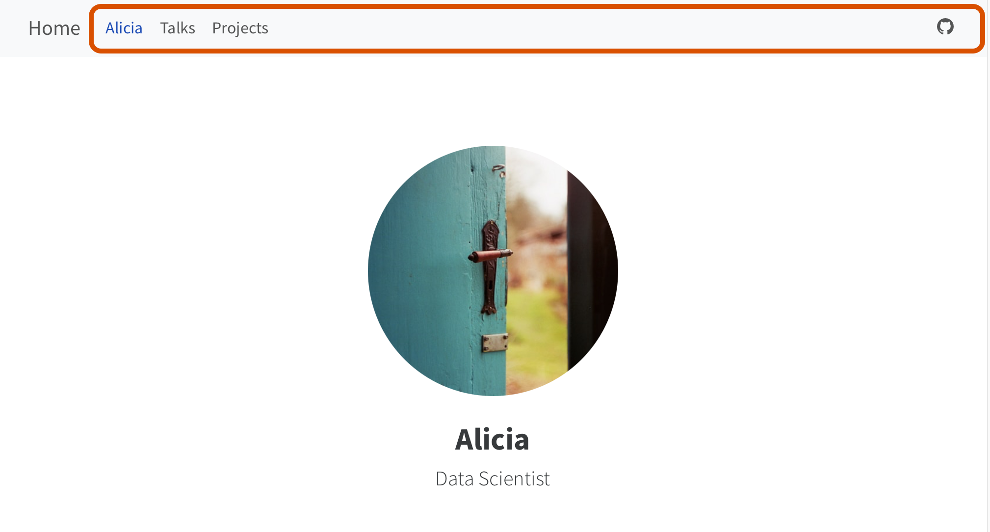
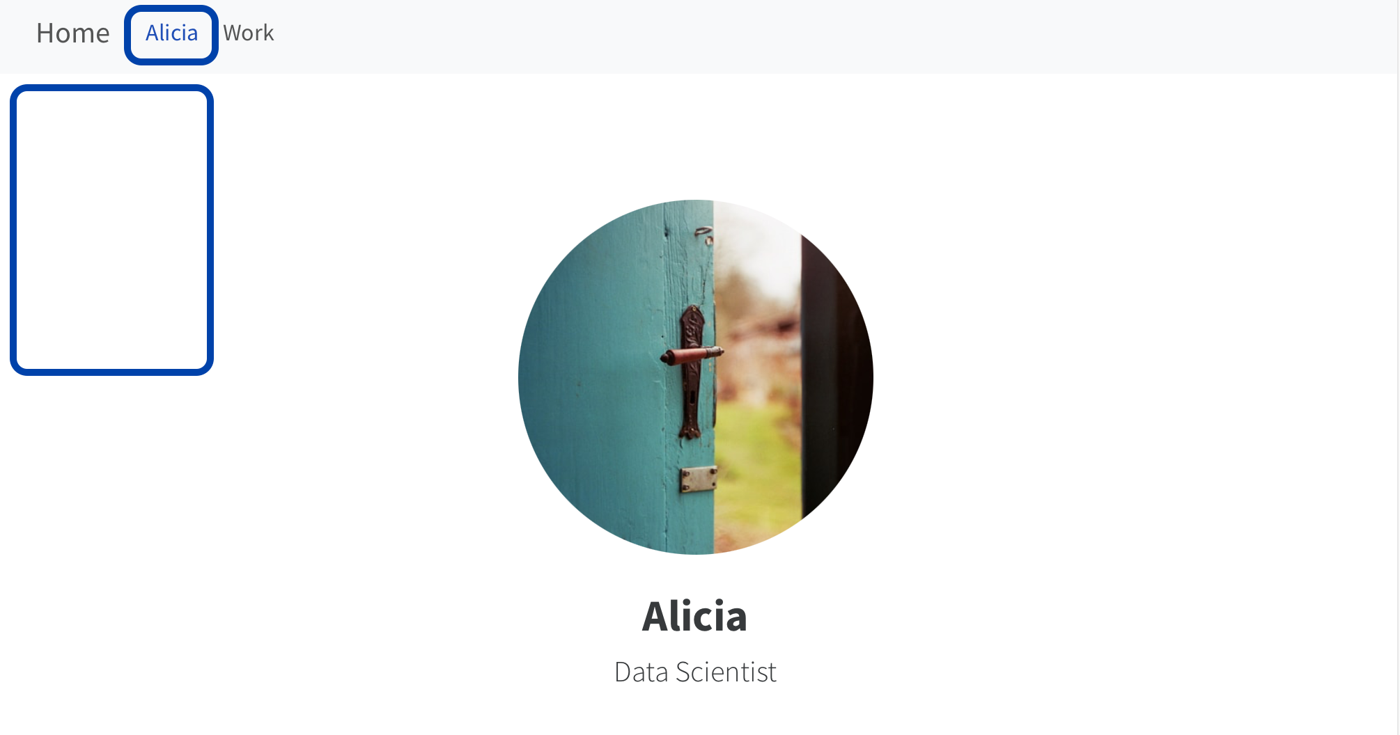
Navigation Bar Links
Use navigation items in left, right and tools
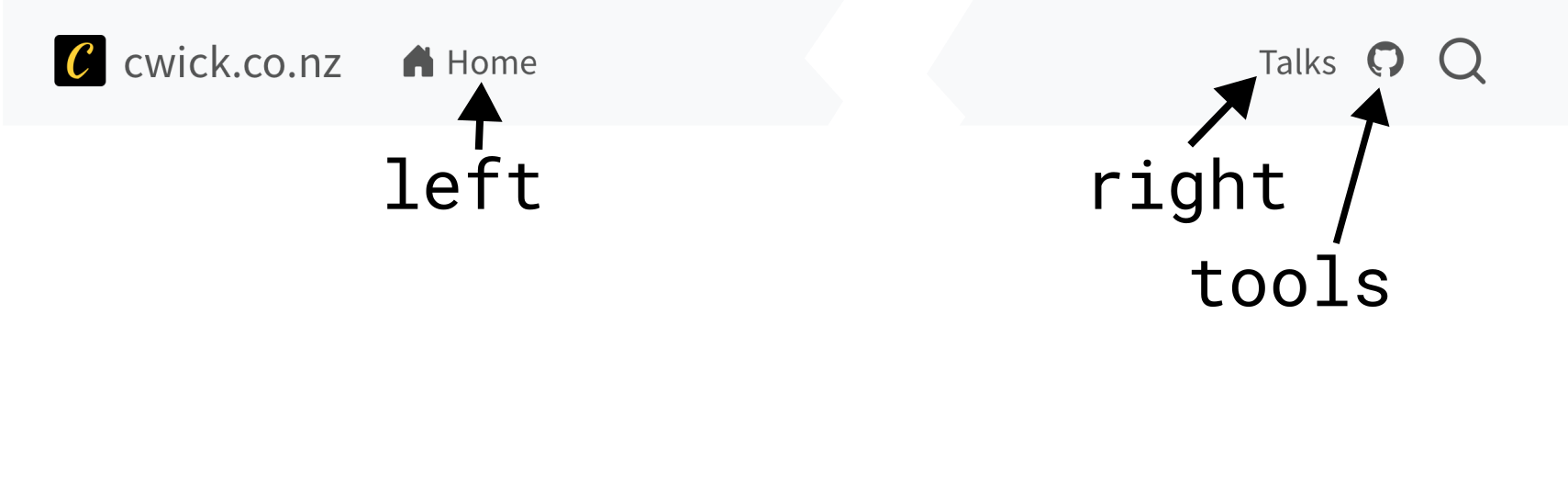
Navigation Bar Links
Navigation Bar Options
Other customization: title, logo, search
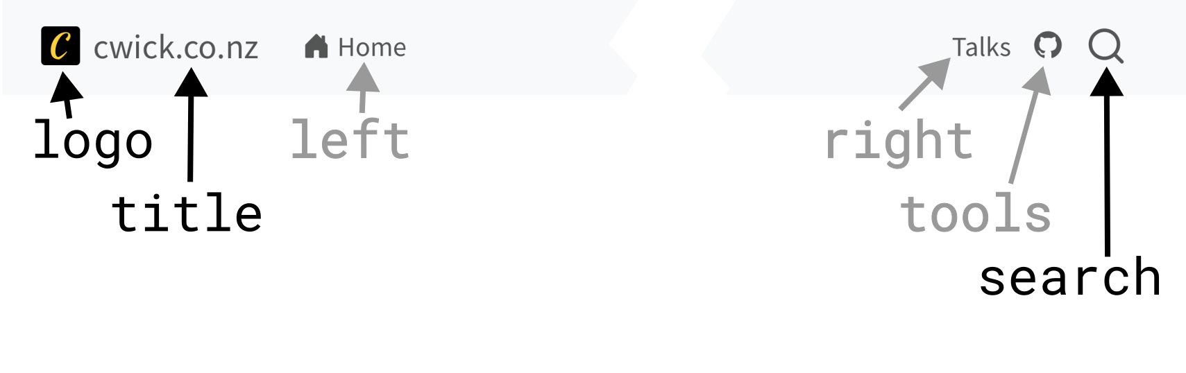
Navigation Bar Options
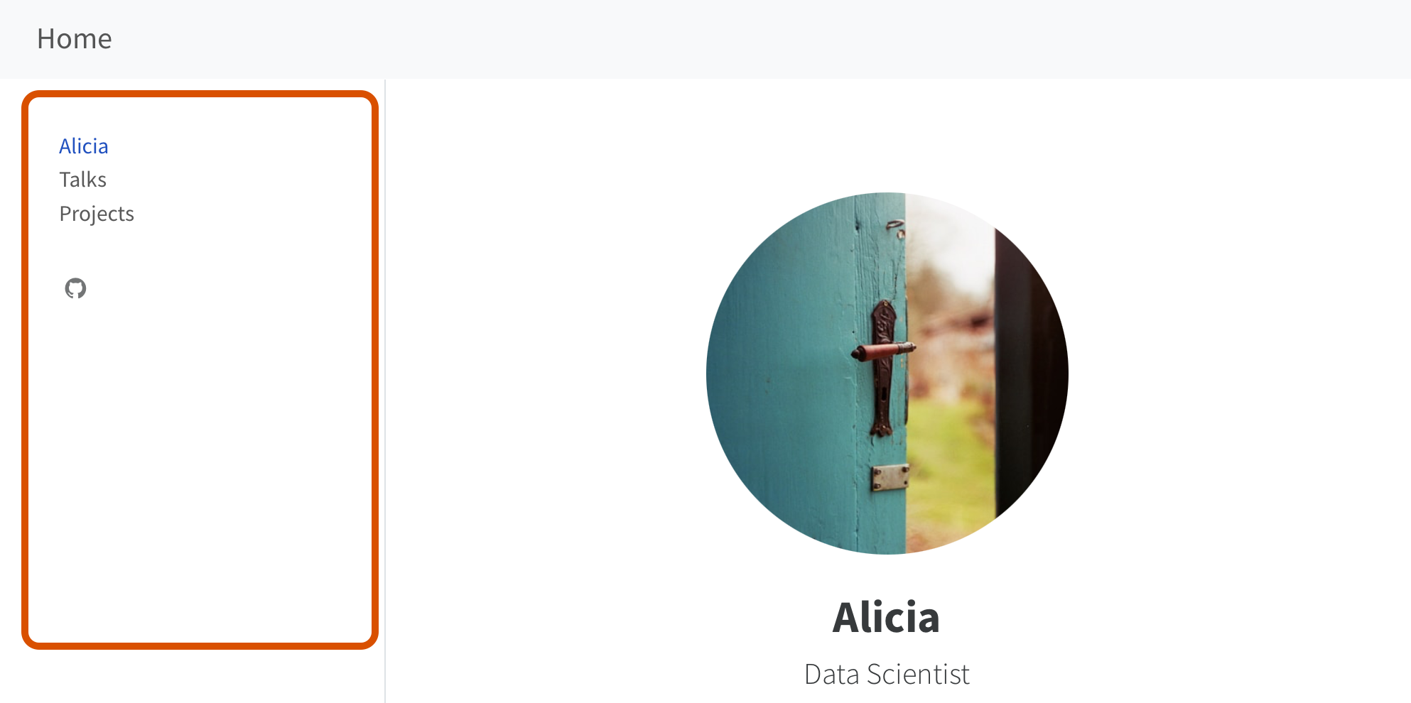
Navigation Elements
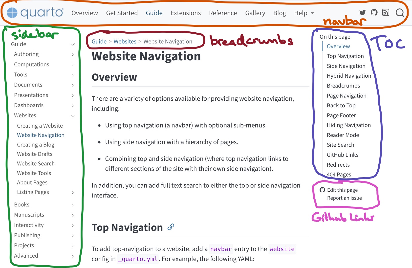
Primary Navigation
Top navigation
Side navigation
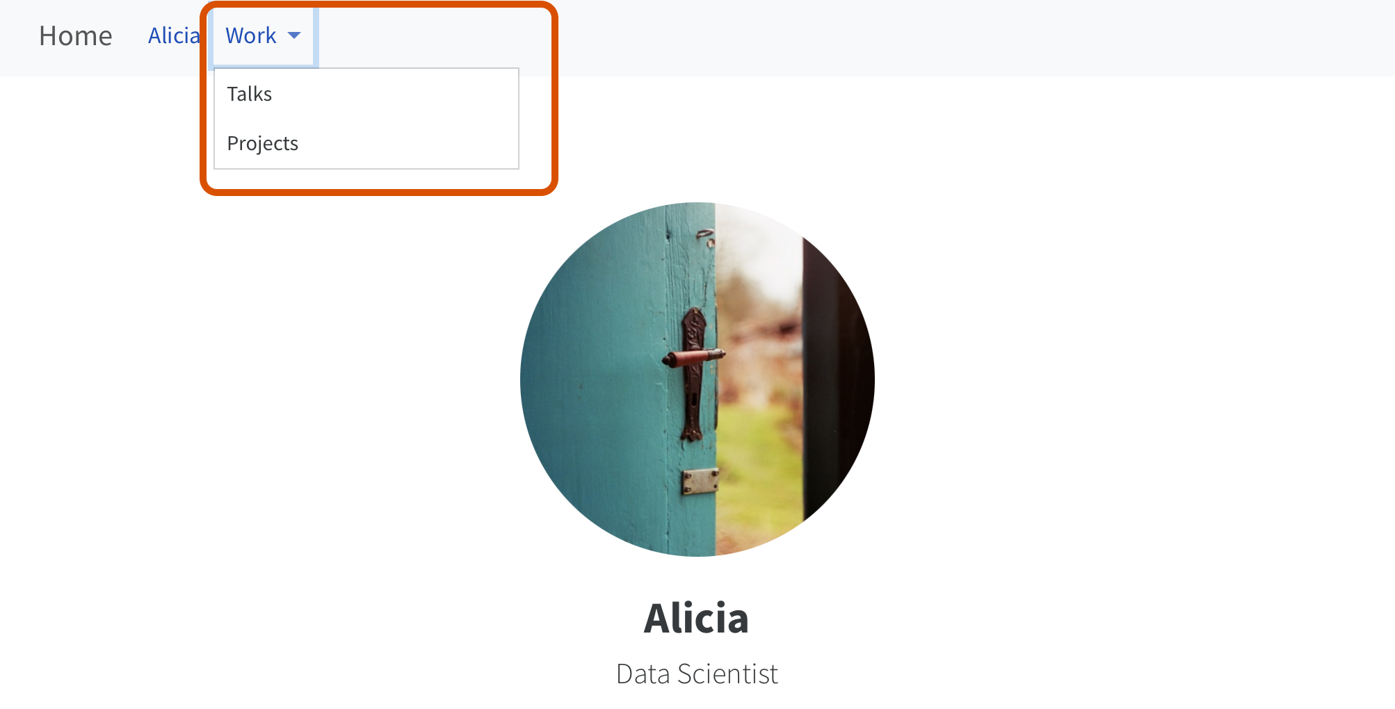
Nested Navigation
Top navigation
Side navigation
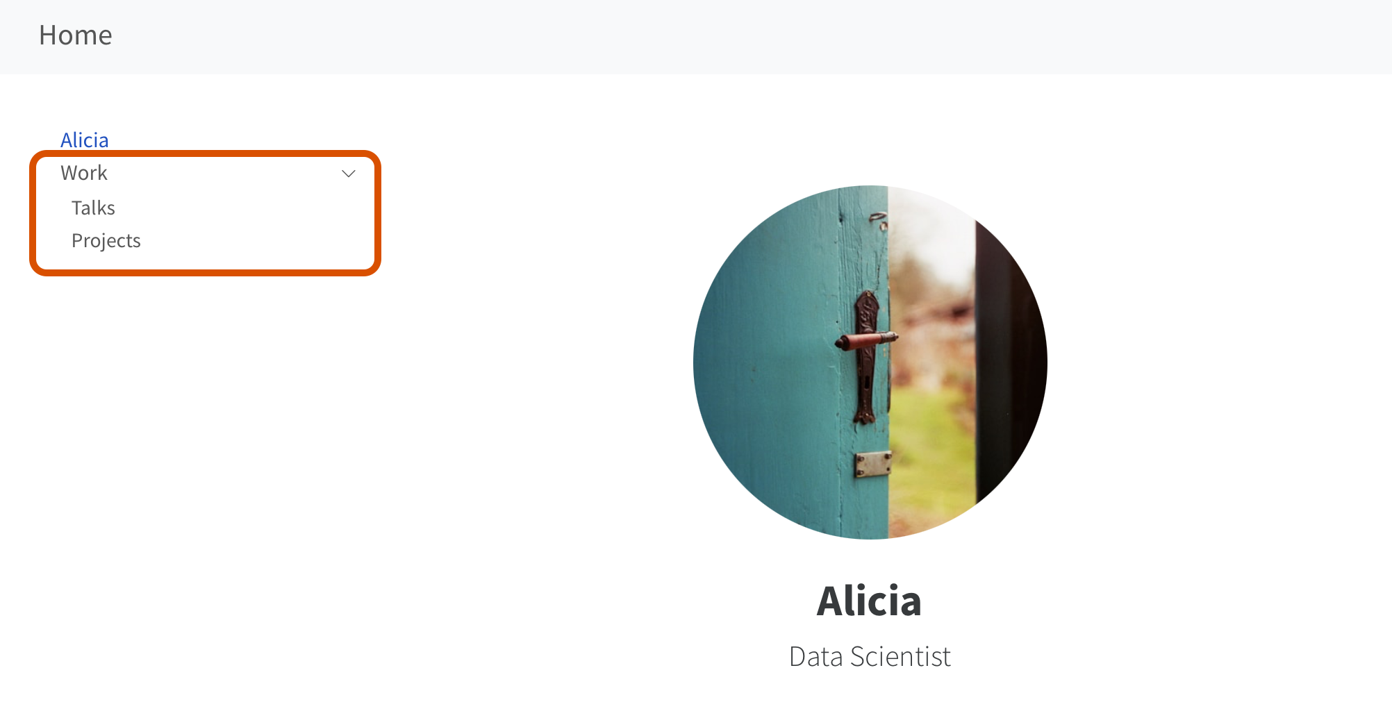
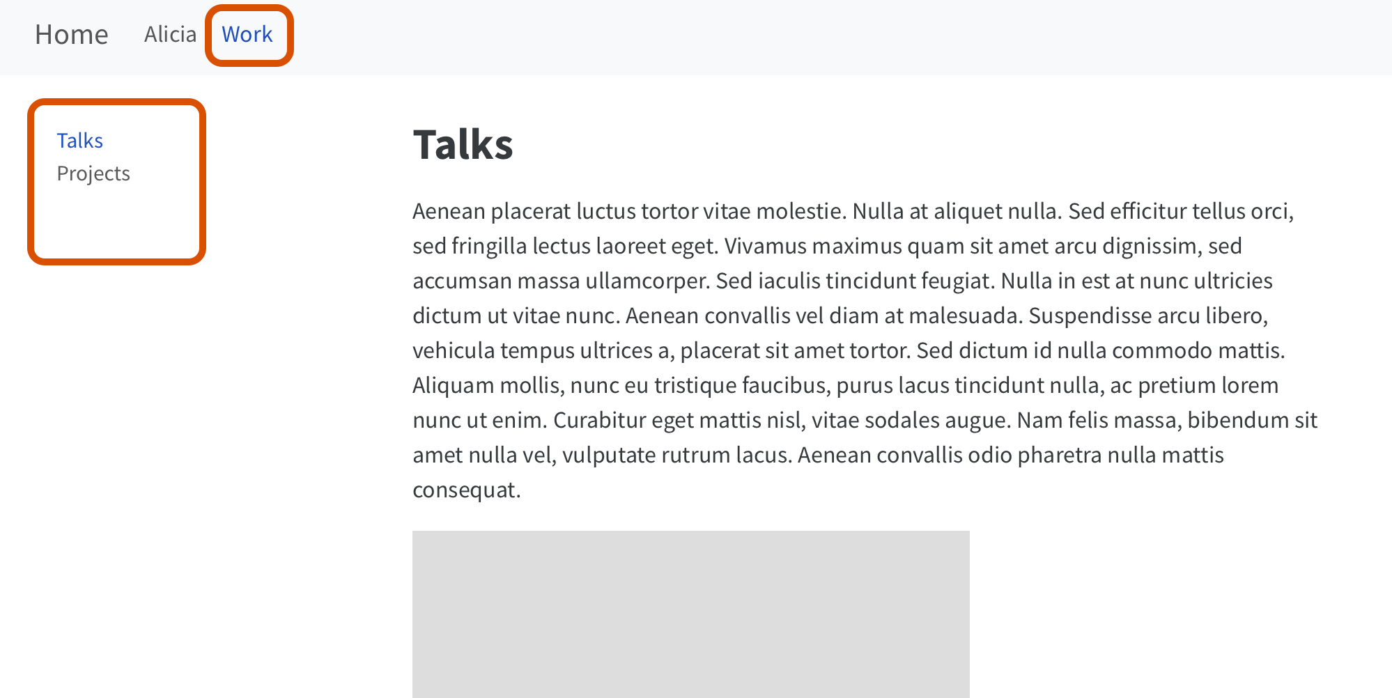
Hybrid Navigation
Top navigation navigates between the different “sections” of the website.
Each “section” has its own side navigation.
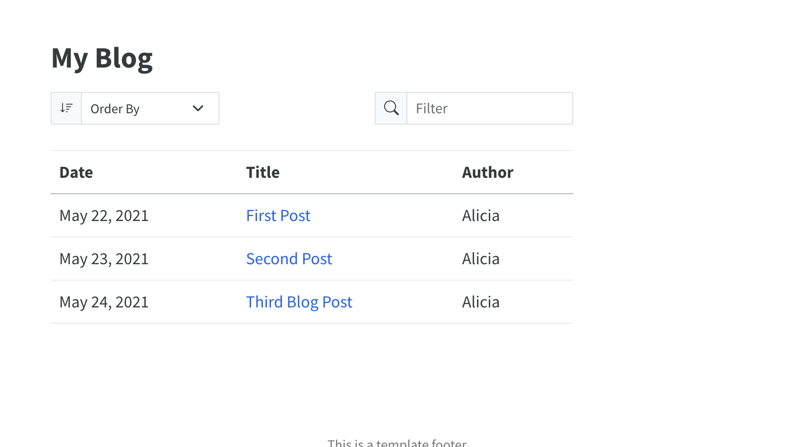
A listing is…
- An automatically generated list of content
- Styled via a template, (built-in
type, or customtemplate) - Can be included on any page
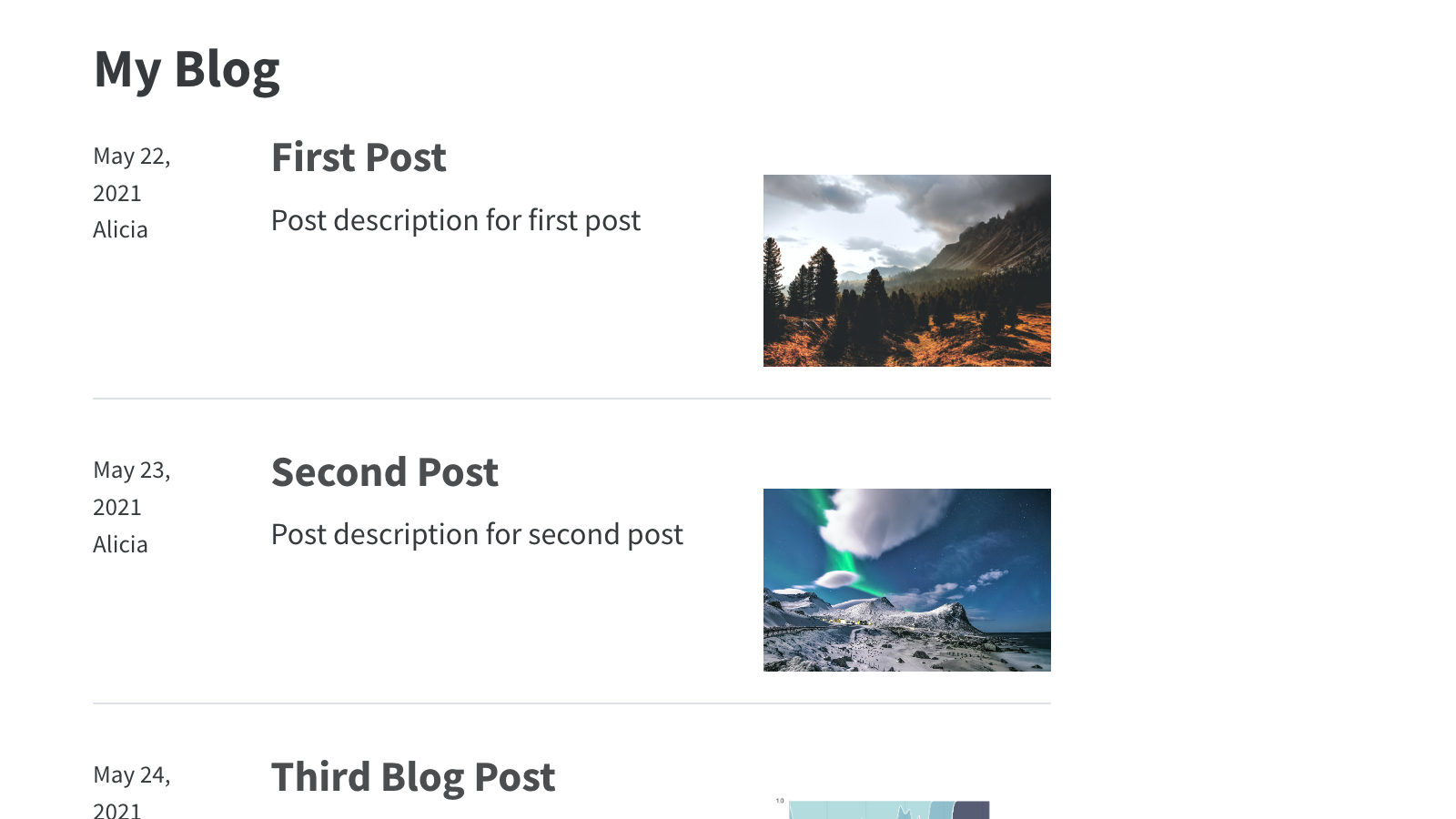
Generated from documents YAML

blog/third-post/index.qmd
---
title: "First Post"
description: "Post description for first post"
author: "Alicia"
date: "5/22/2021"
image: "cover.jpg"
categories:
  - Science
  - Technology
---Default
Grid
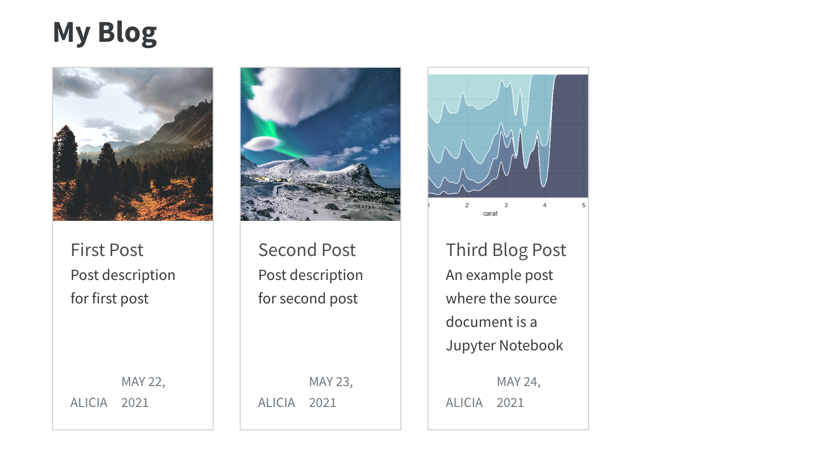
Table
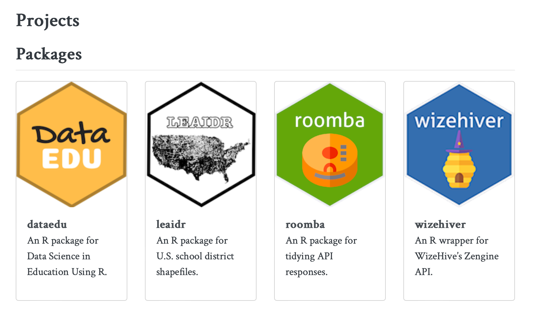
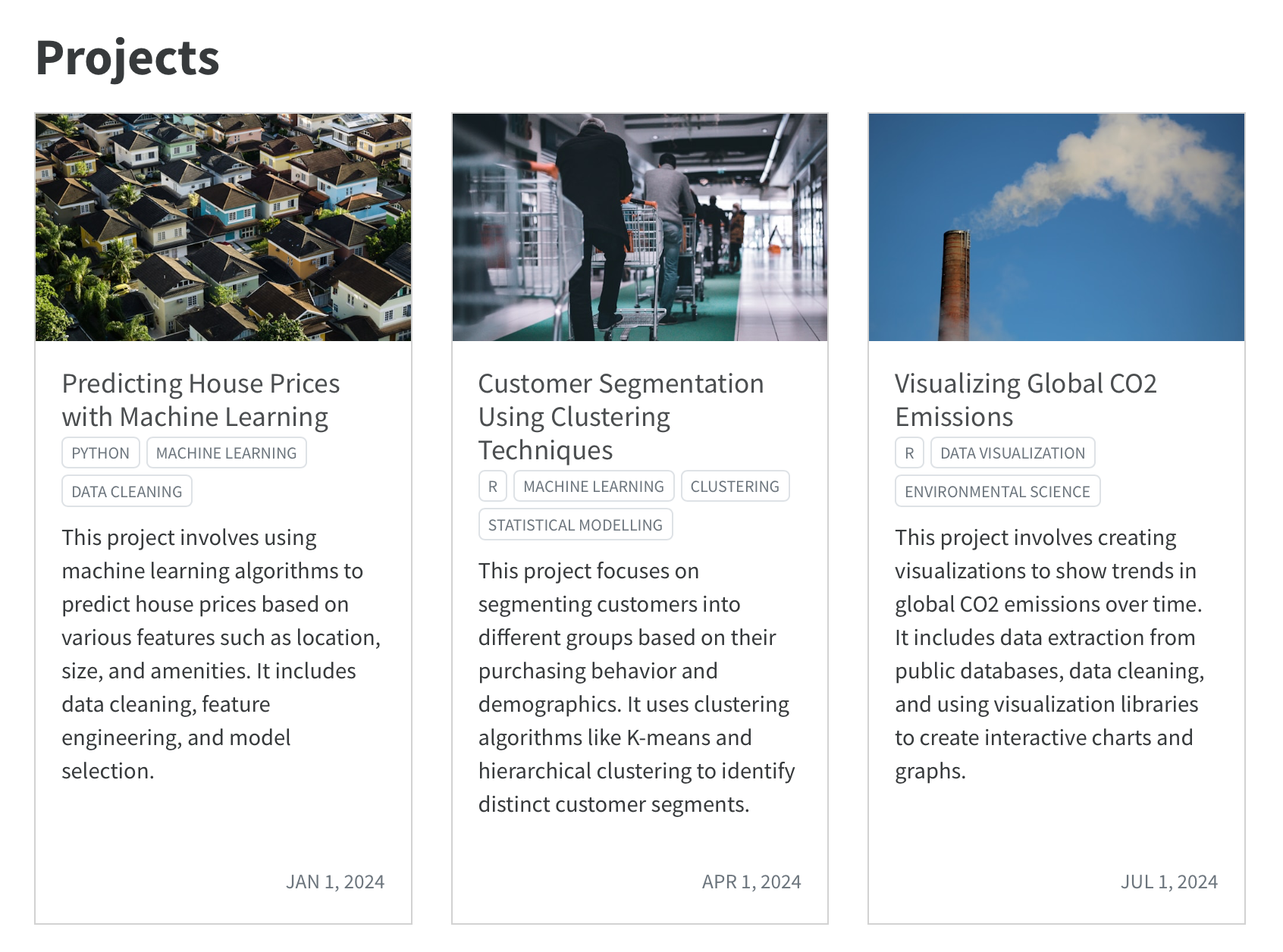
Use listings for projects
https://ivelasq.rbind.io/project
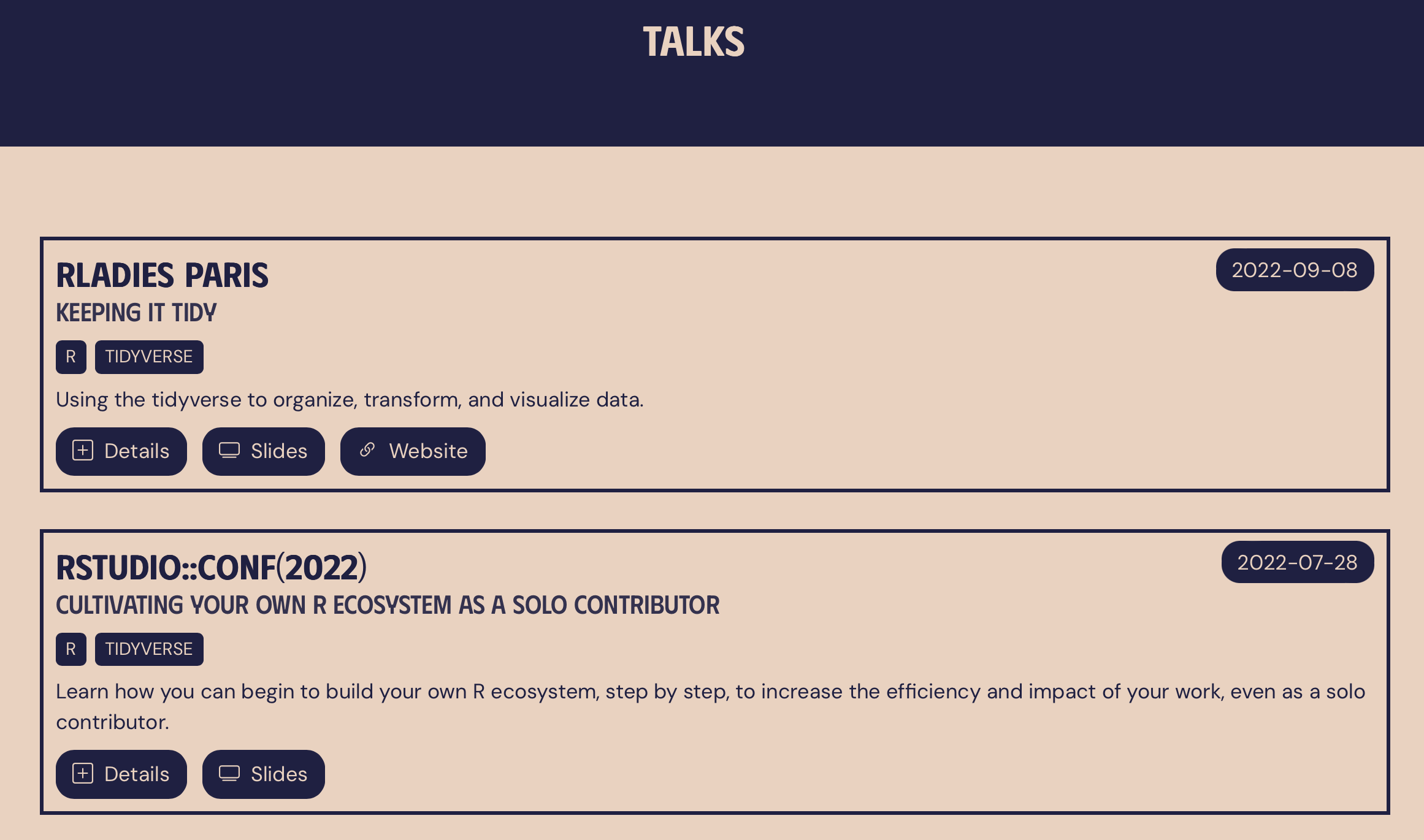
Use listings for talks
https://meghan.rbind.io/talks/
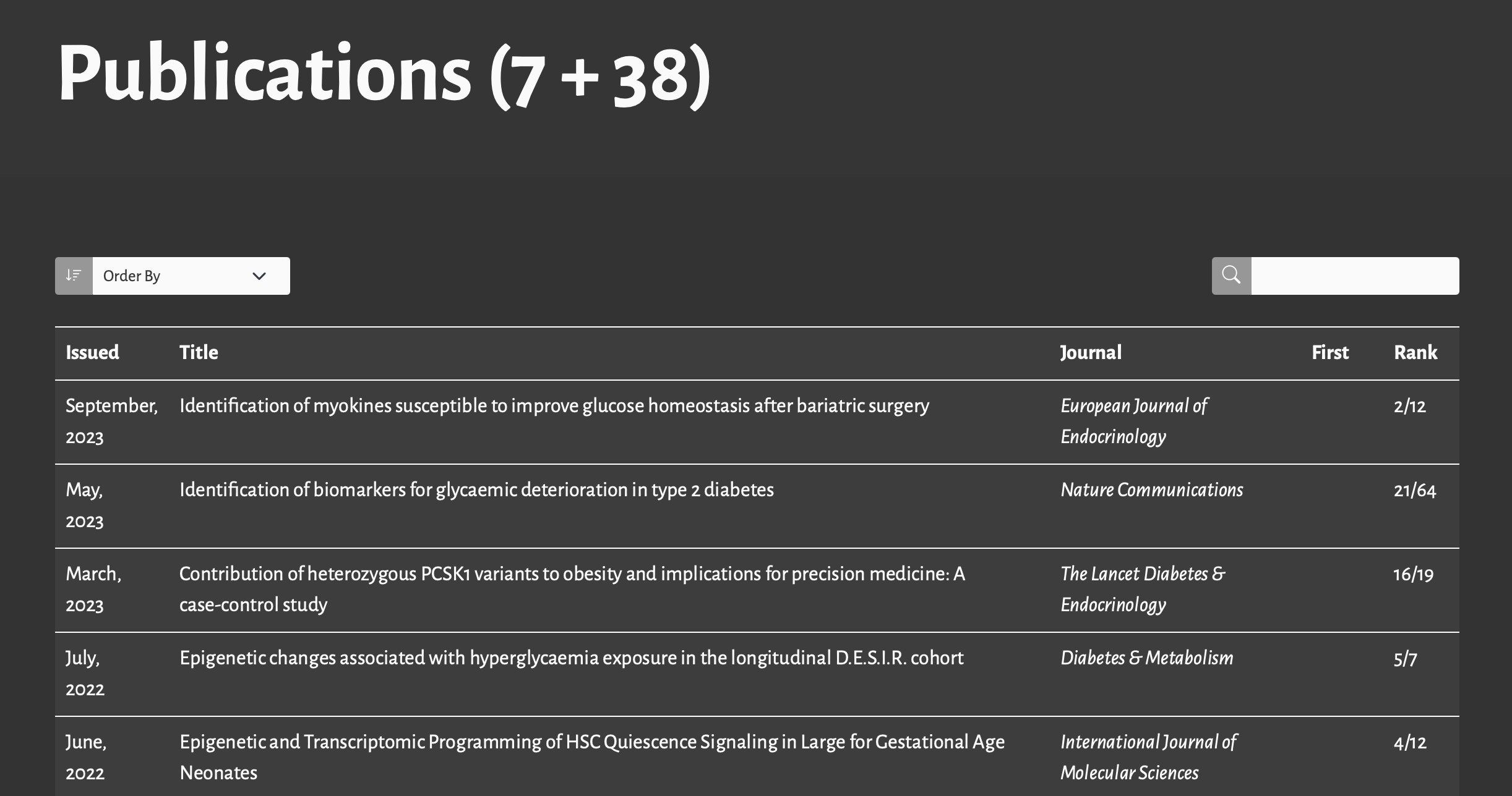
Use listings for publications
https://mickael.canouil.fr/publications
The listed content can be a YAML file
References
Huge thanks the following people who have generated and shared most of the content of this lecture:
Charlotte Wickham: Quarto Websites: Navigation
Charlotte Wickham: Quarto Websites: Listings


Thanks for your attention and don’t hesitate to ask if you have any questions!
@damien_dupre
@damien-dupre
https://damien-dupre.github.io
damien.dupre@dcu.ie