10:00
Lecture 10: Quarto Dashboards
BAA1028 - Workflow & Data Management
Quarto — https://quarto.org
An open-source scientific and technical publishing system that builds on standard markdown with features essential for scientific communication.
Pandoc Markdown
Jupyter Kernels
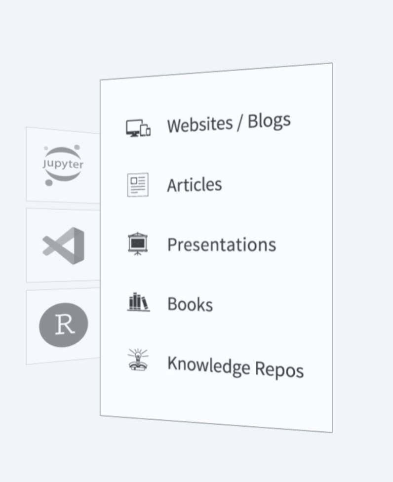
Dozens of Output Formats
Specialized Project Types
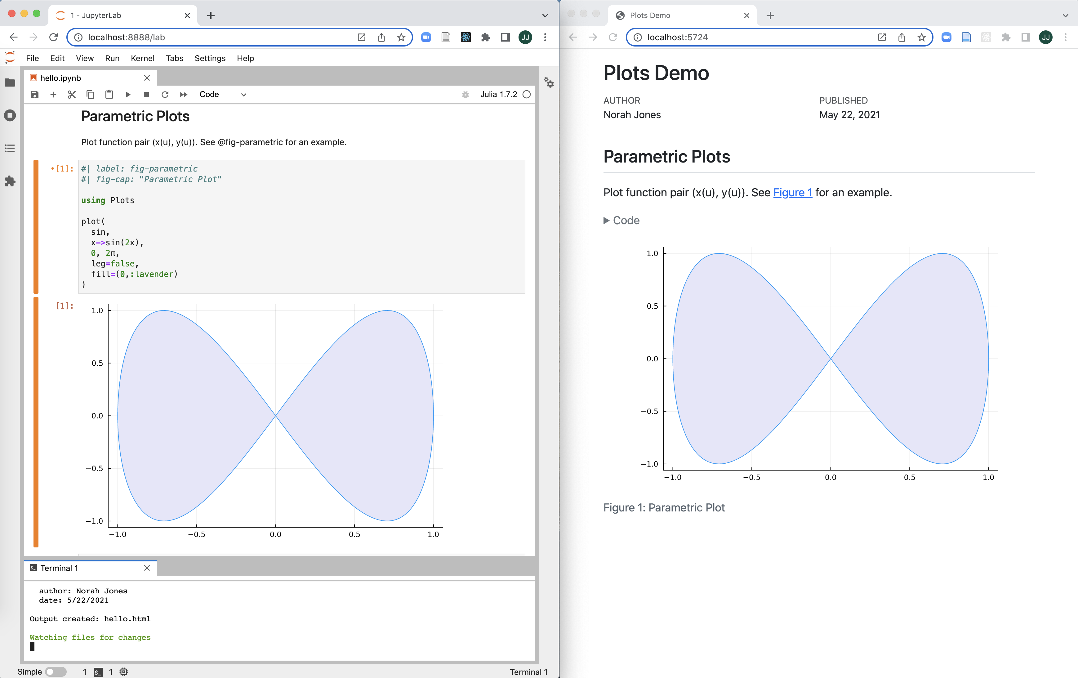
How does Quarto work?
Render and Preview
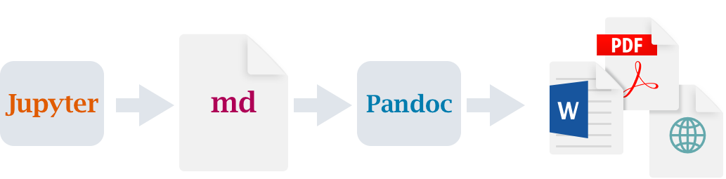
Rendering Pipeline
Notebook workflow (no execution occurs by default):
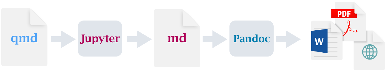
Plain text workflow (.qmd => .ipynb then execute cells):
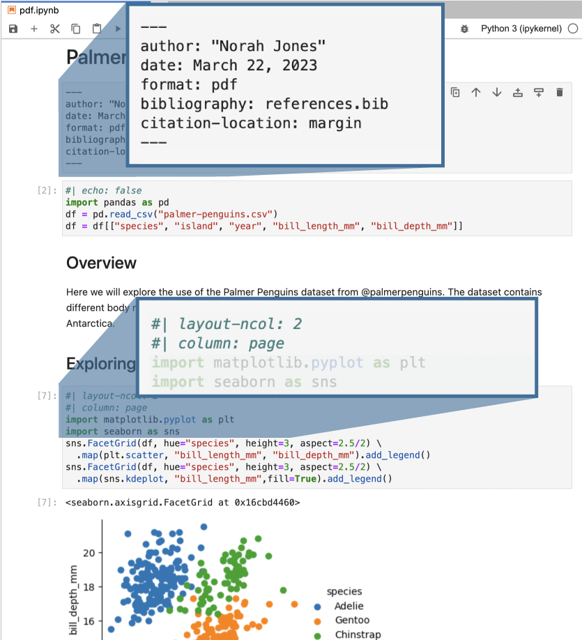
Render Notebook to PDF

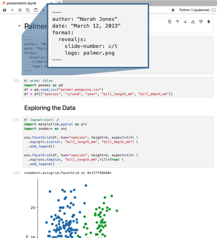
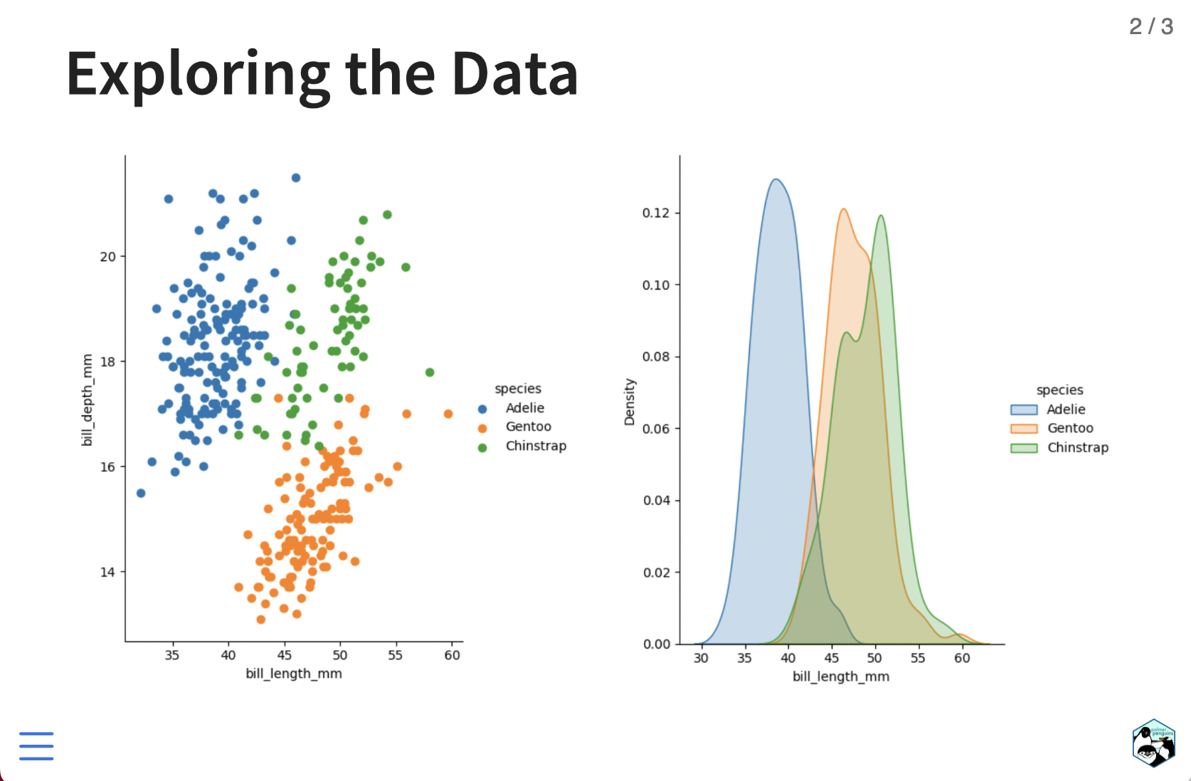
Render Notebook to Revealjs
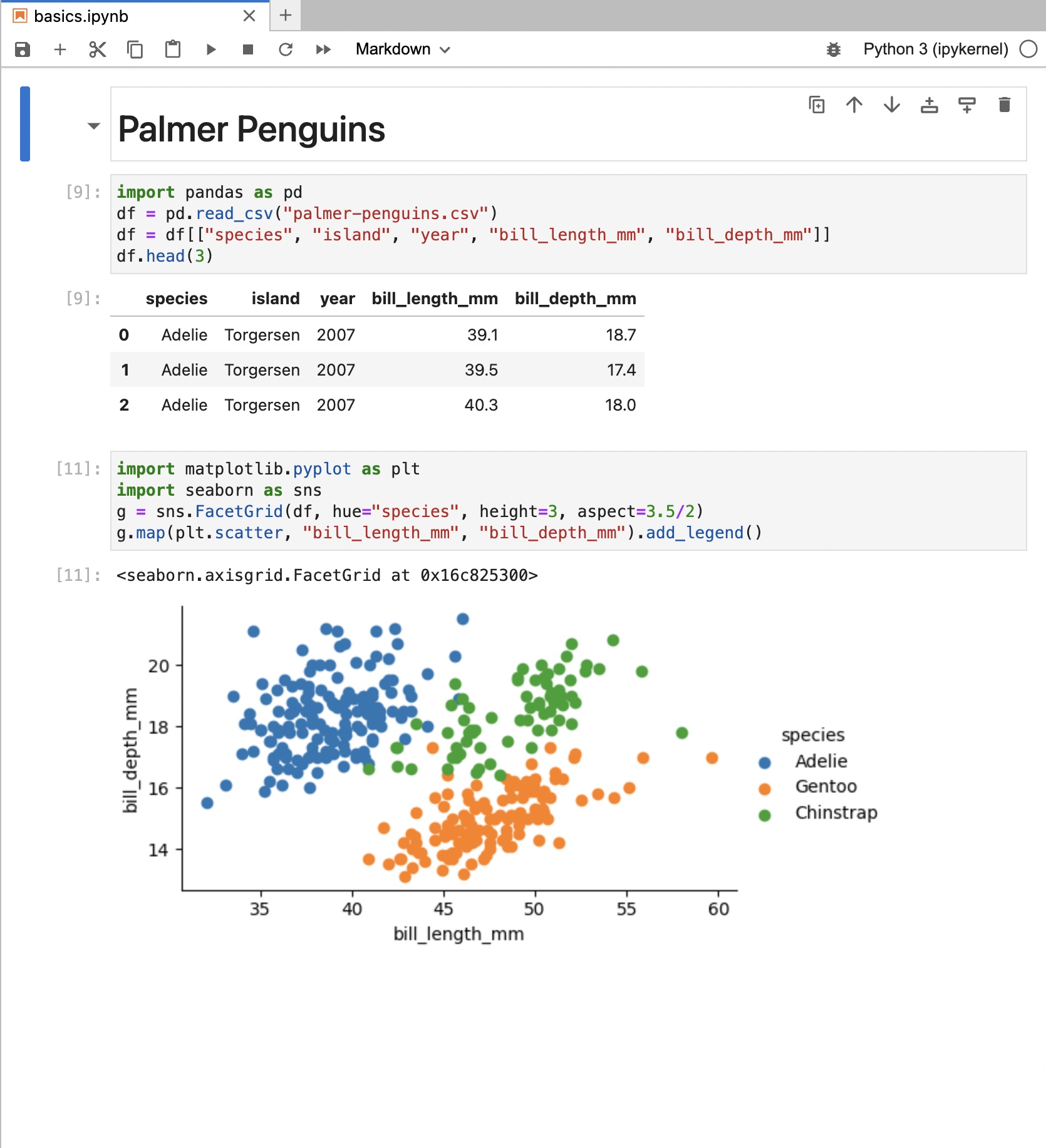
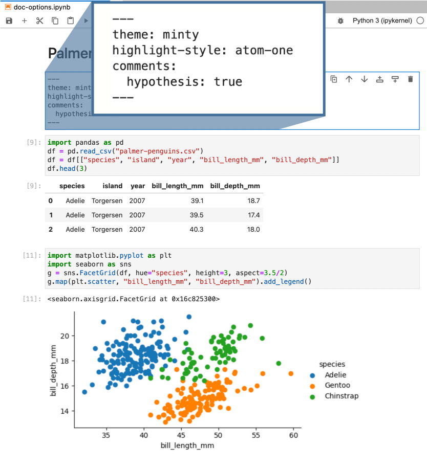
Render Notebook to HTML
default options
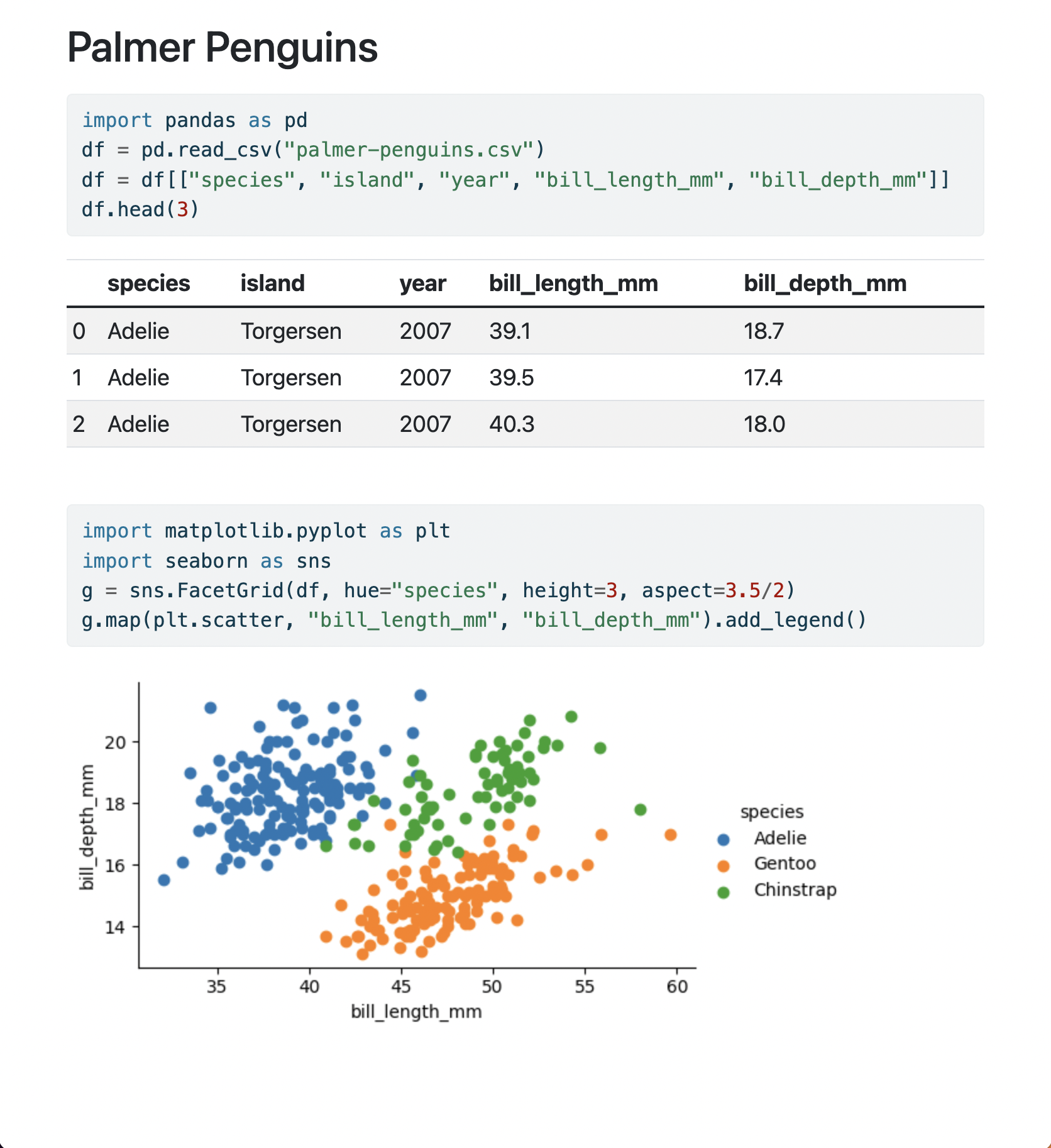
Render Notebook to HTML
document level options
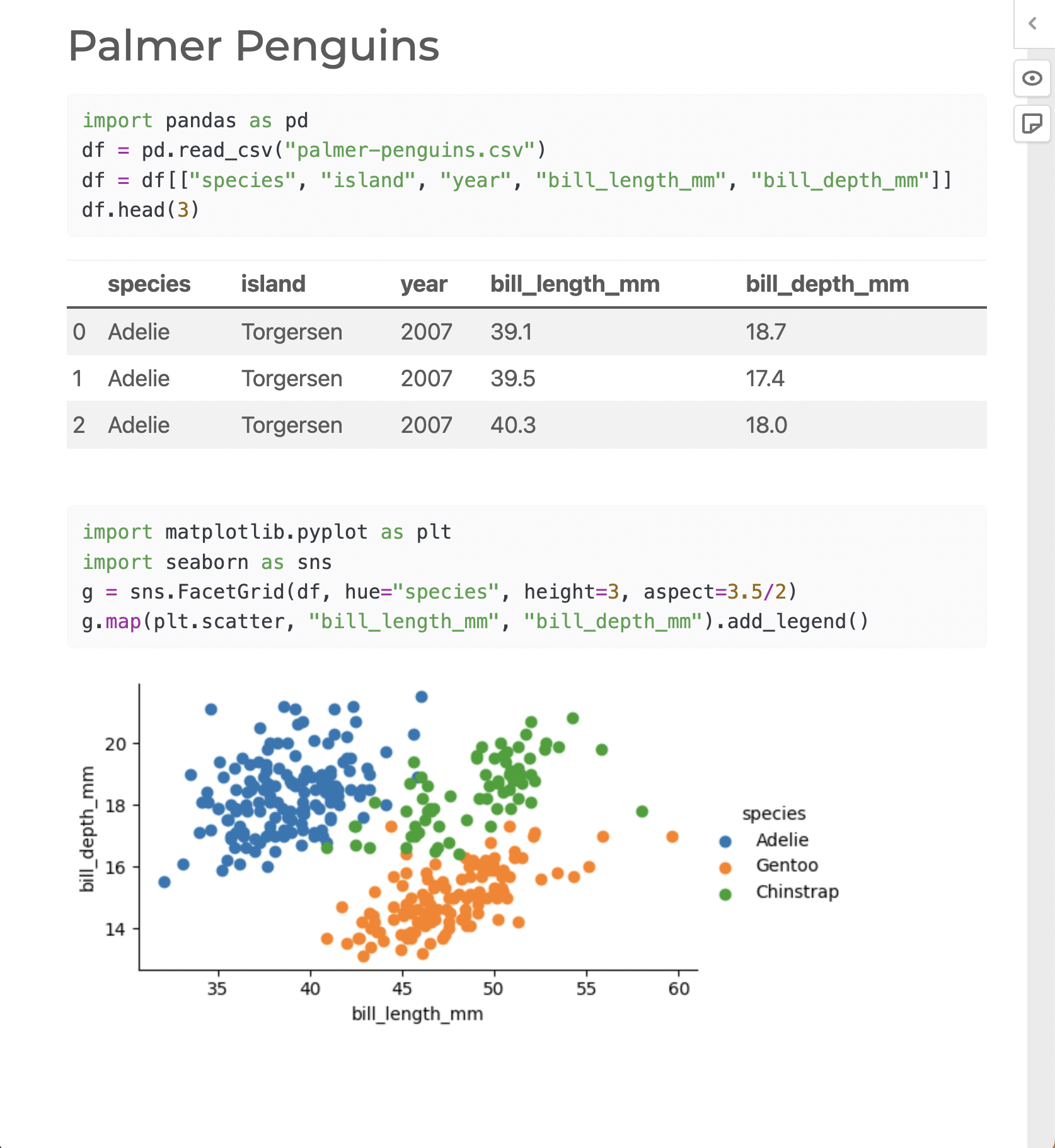
Render Notebook to HTML
document and cell level options


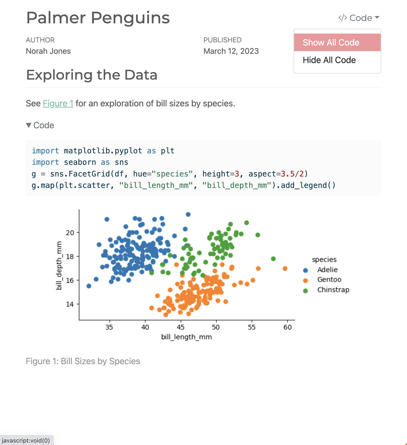
Render Notebook to HTML
document and cell level options
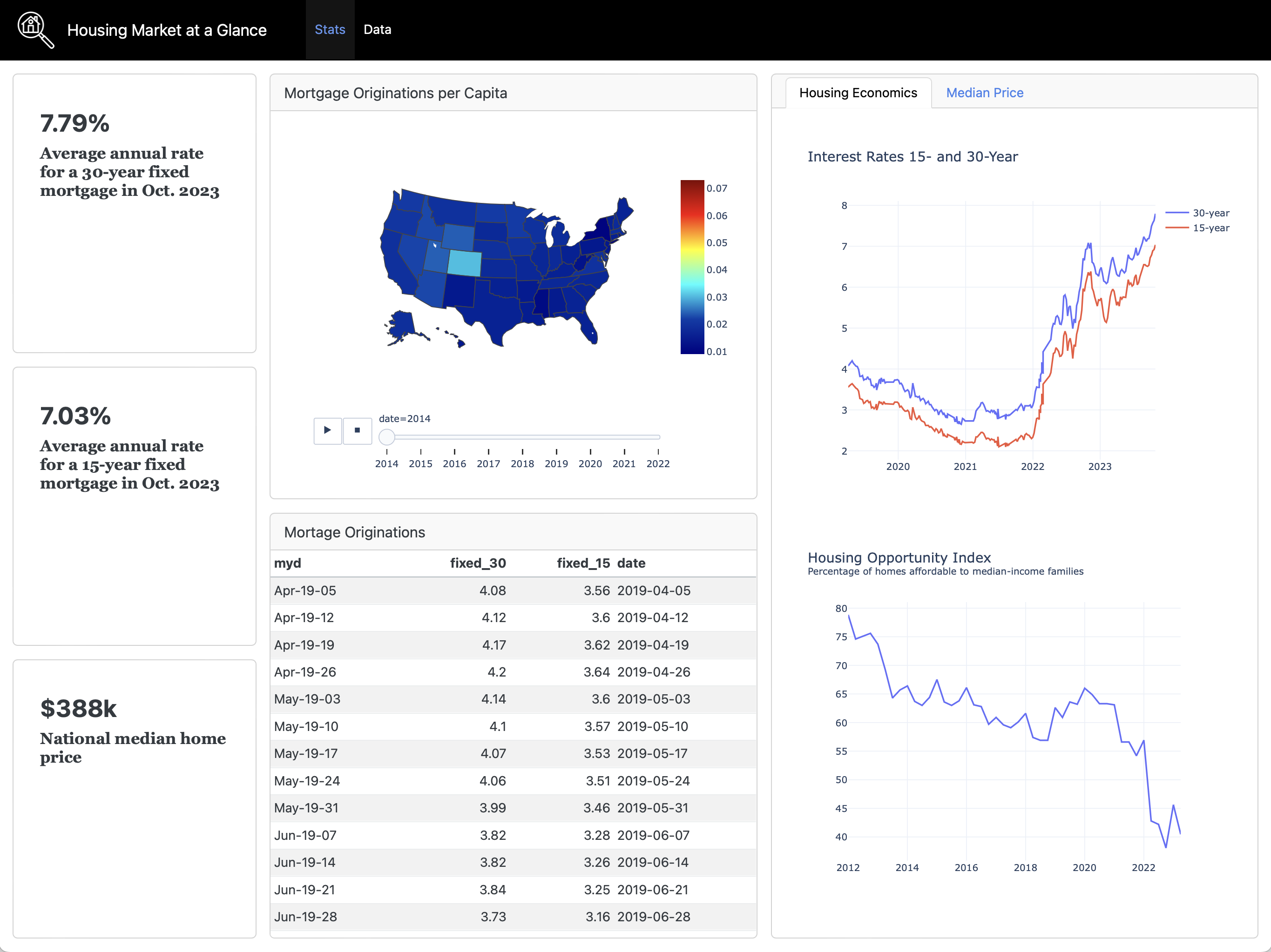
Notebook ➝ Dashboard
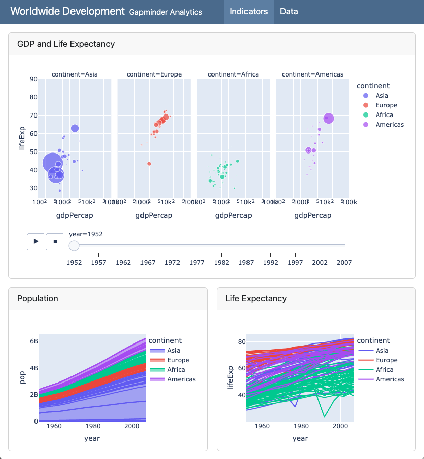
Notebook ➝ Dashboard
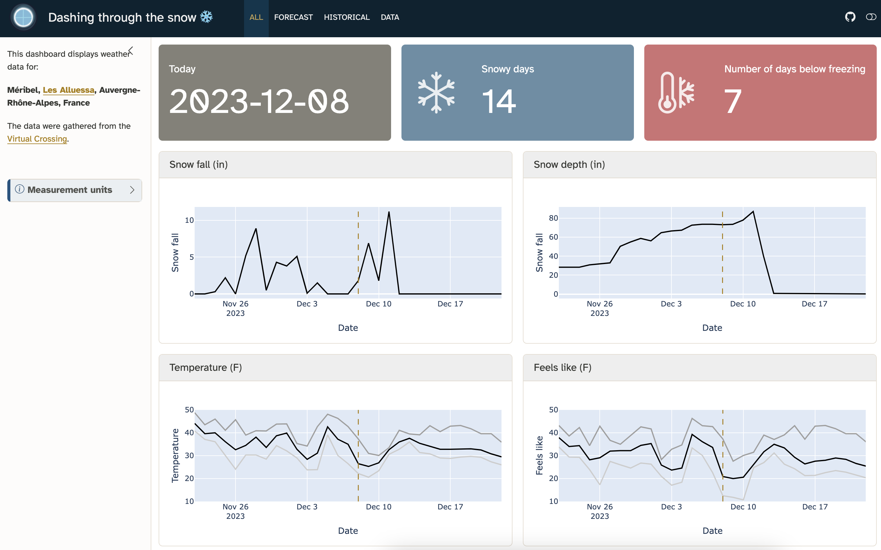
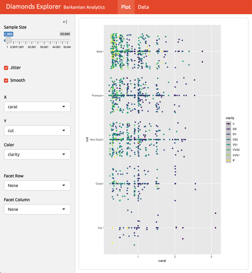
Example 1
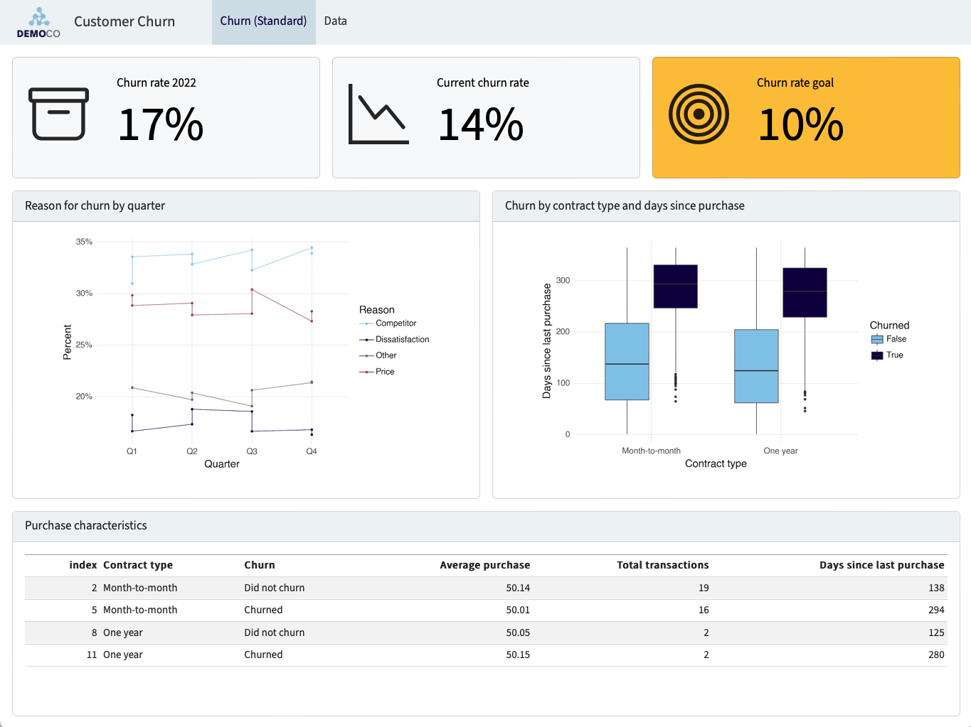
Example 2
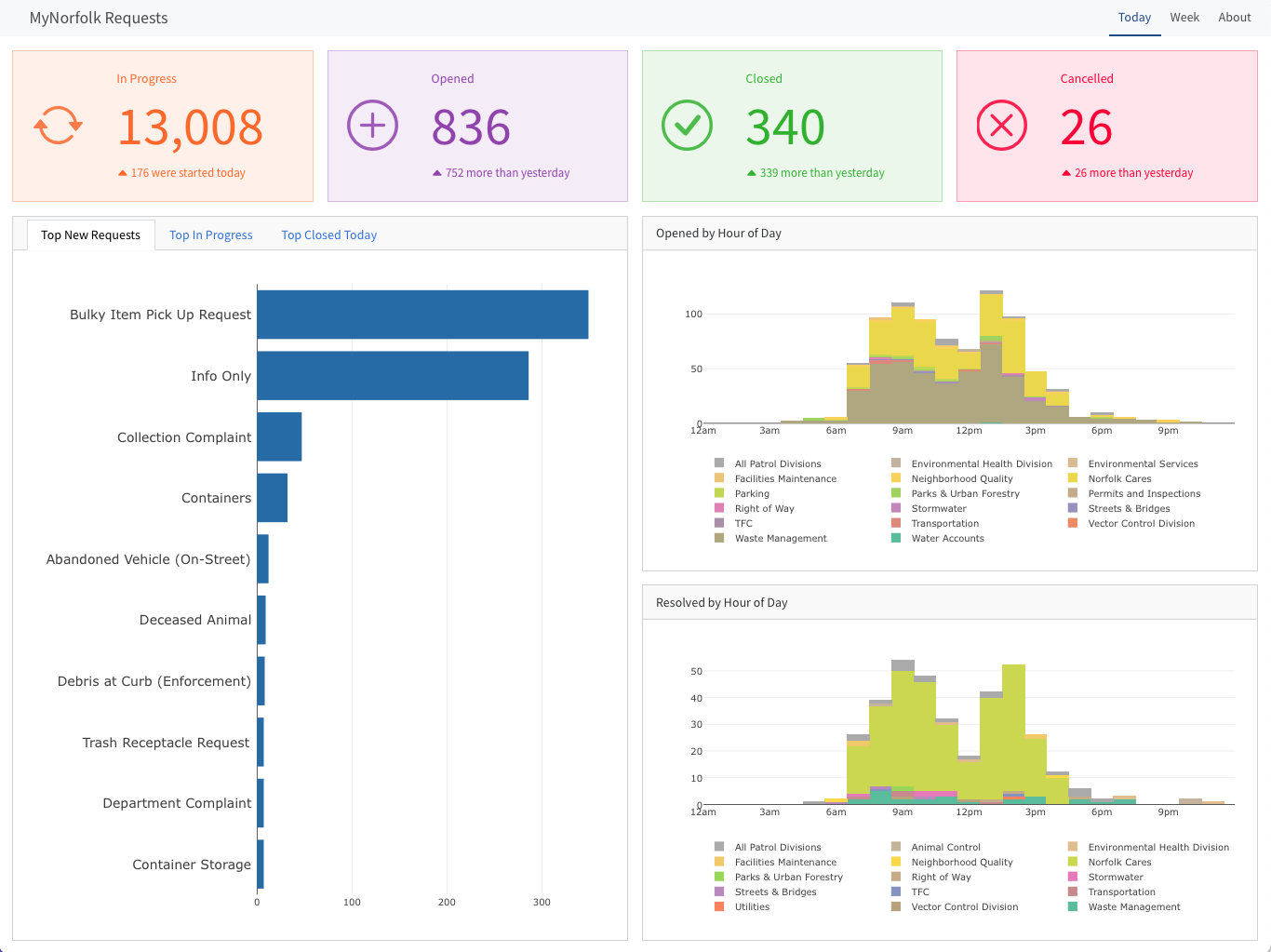
Example 3
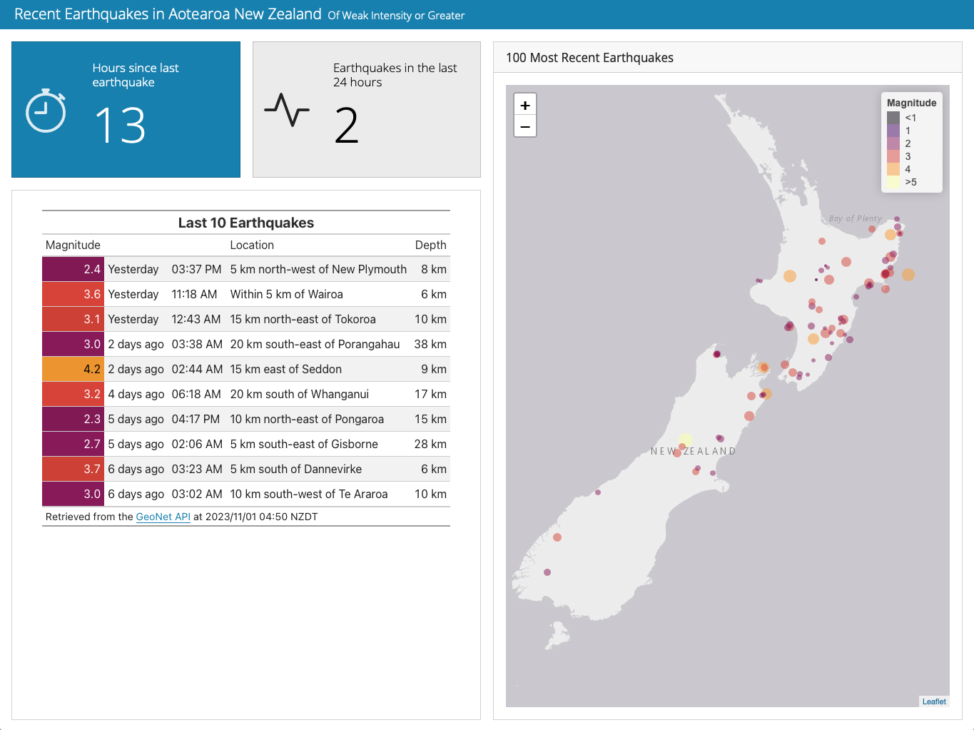
Example 4
Example 5
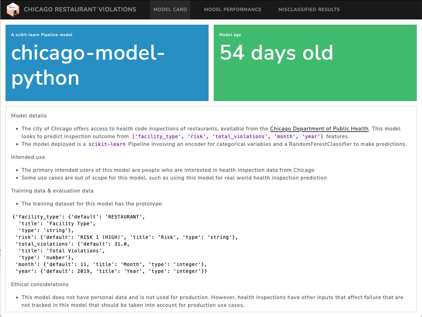
Example 6
Example 7
Navigation Bar and Pages

---
title: "Palmer Penguins"
author: "Cobblepot Analytics"
format:
  dashboard:
    logo: images/penguins.png
    nav-buttons: [linkedin, twitter, github]
---

# Bills

# Flippers

# Data
Sidebars: Page Level
---
title: "Sidebar"
format: dashboard
---

# Page 1

## {.sidebar}

```{python}
```

## Column

```{python}
```

```{python}
```
Sidebars: Global
---
title: "Global Sidebar"
format: dashboard
---

# {.sidebar}

Sidebar content (e.g. inputs)

# Plot

```{python}
```

# Data

```{python}
```
Layout: Rows
---
title: "Focal (Top)"
format: dashboard
---

## Row {height=70%}

```{python}
```

## Row {height=30%}

```{python}
```

```{python}
```
Example
Layout: Columns
---
title: "Focal (Top)"
format:
  dashboard:
    orientation: columns
---

## Column {width=60%}

```{python}
```

## Column {width=40%}

```{python}
```

```{python}
```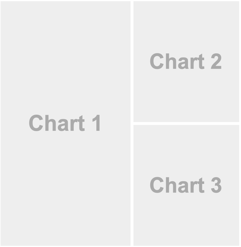
Example
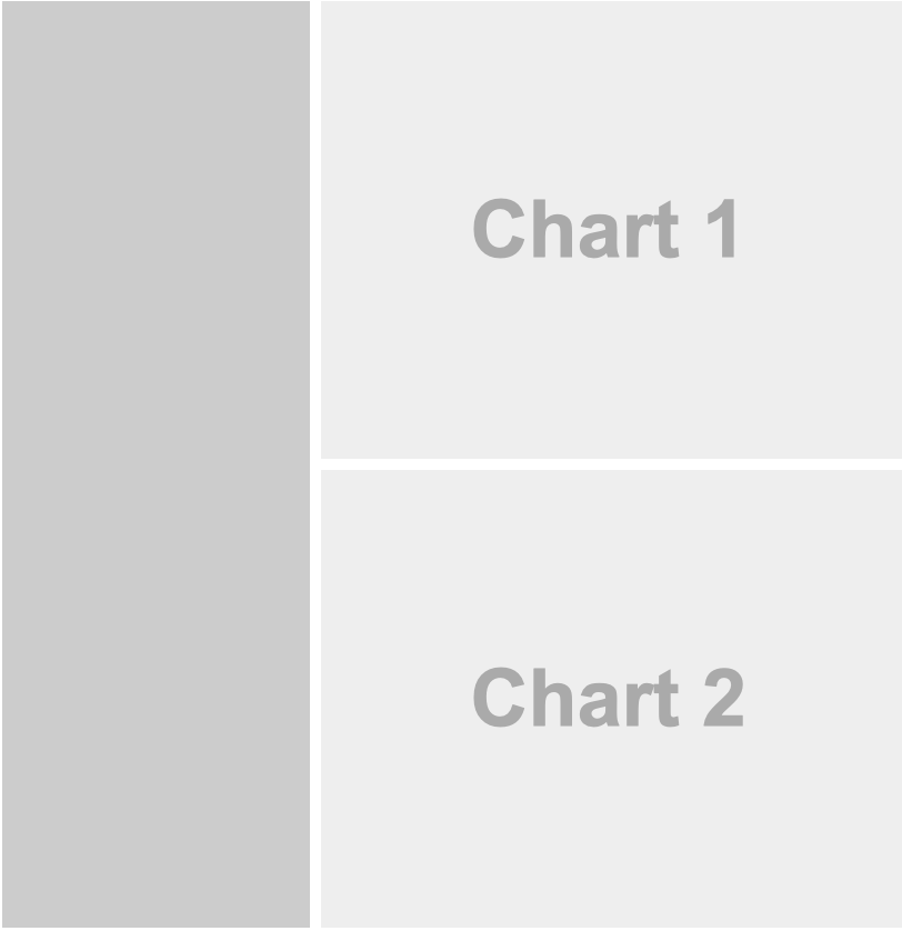
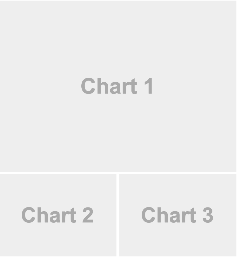
Tabset
---
title: "Palmer Penguins"
format: dashboard
---

## Row

```{python}
```

## Row {.tabset}

```{python}
#| title: Chart 2
```

```{python}
#| title: Chart 3
```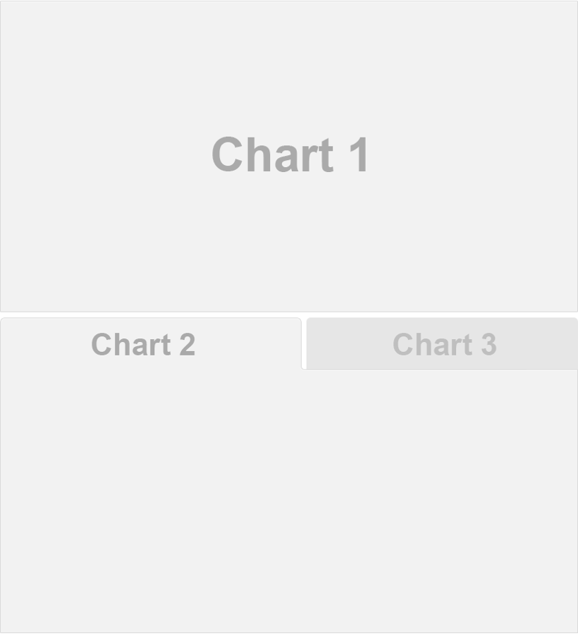
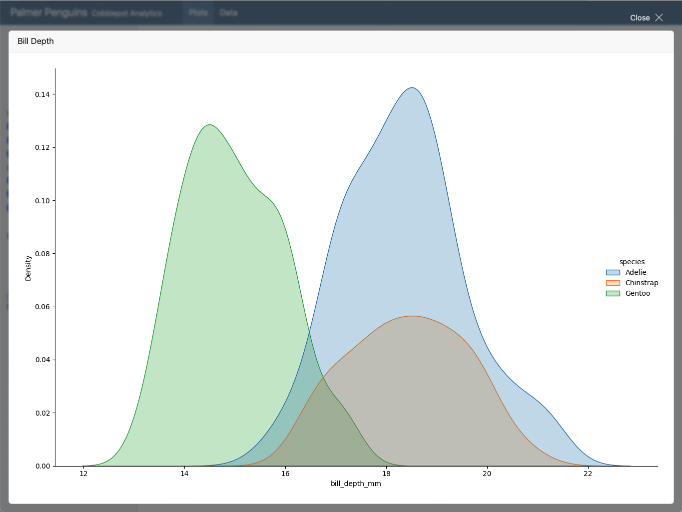
Example
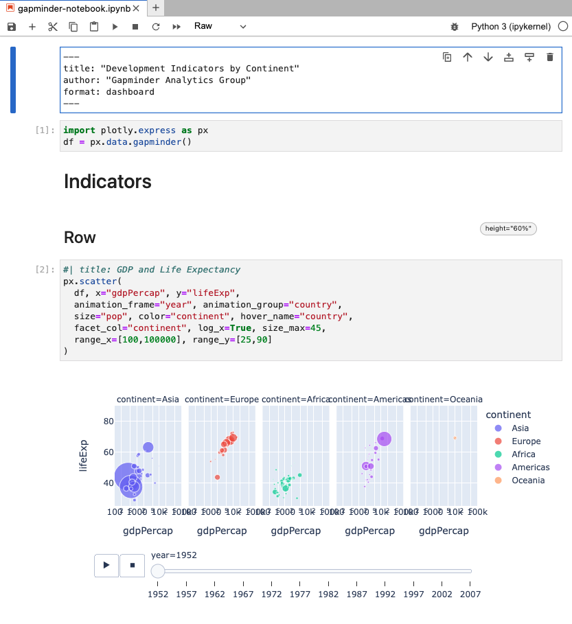
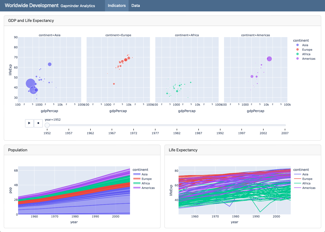
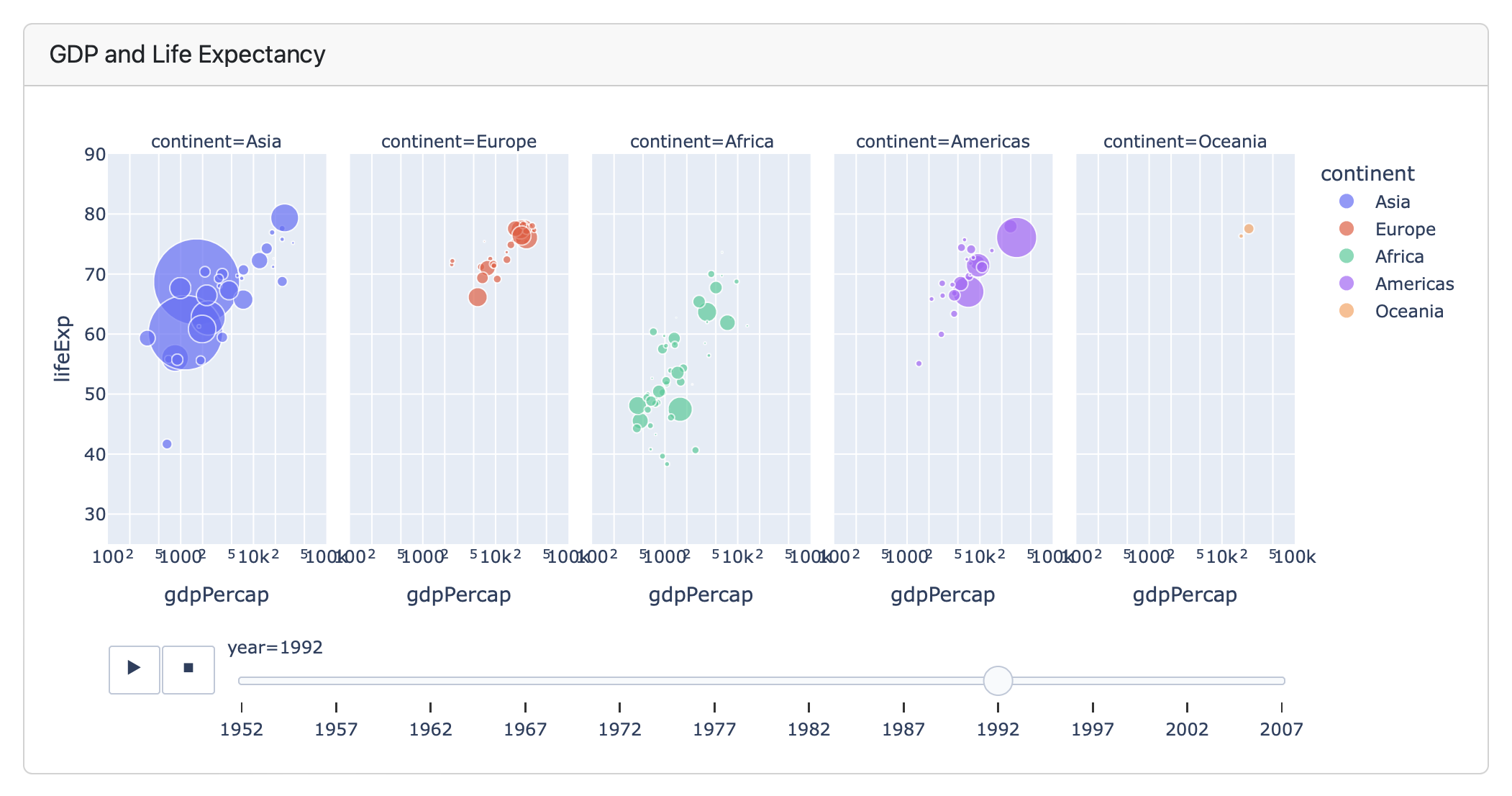
Plots
```{python}
#| title: GDP and Life Expectancy
import plotly.express as px
df = px.data.gapminder()
px.scatter(
  df, x="gdpPercap", y="lifeExp",
  animation_frame="year", animation_group="country",
  size="pop", color="continent", hover_name="country",
  facet_col="continent", log_x=True, size_max=45,
  range_x=[100,100000], range_y=[25,90]
)
```
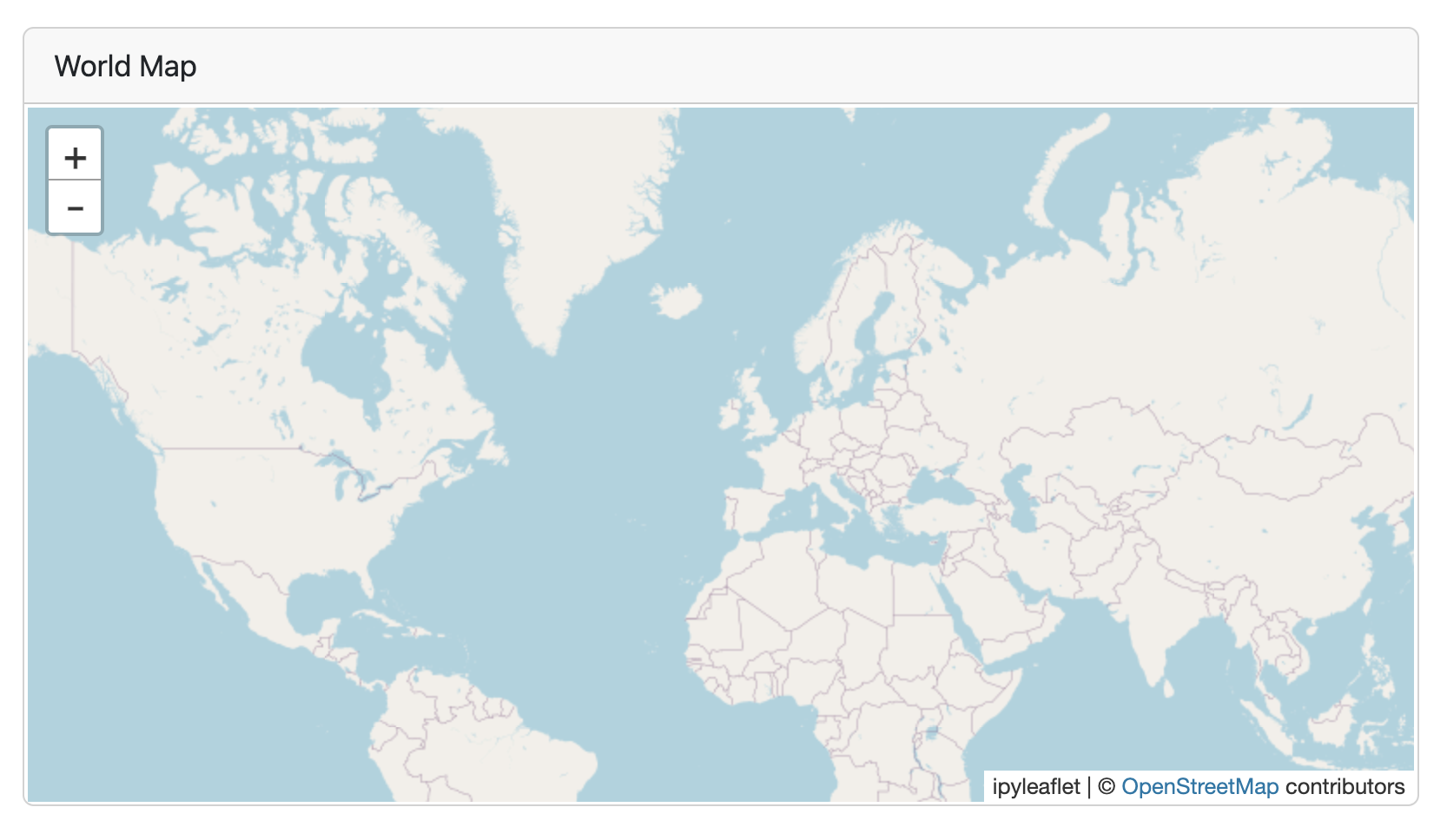
```{python}
#| title: "World Map"
#| padding: 0px
from ipyleaflet import Map, basemaps, basemap_to_tiles
Map(basemap=basemap_to_tiles(basemaps.OpenStreetMap.Mapnik),
    center=(48.204793, 350.121558), zoom=2)
```
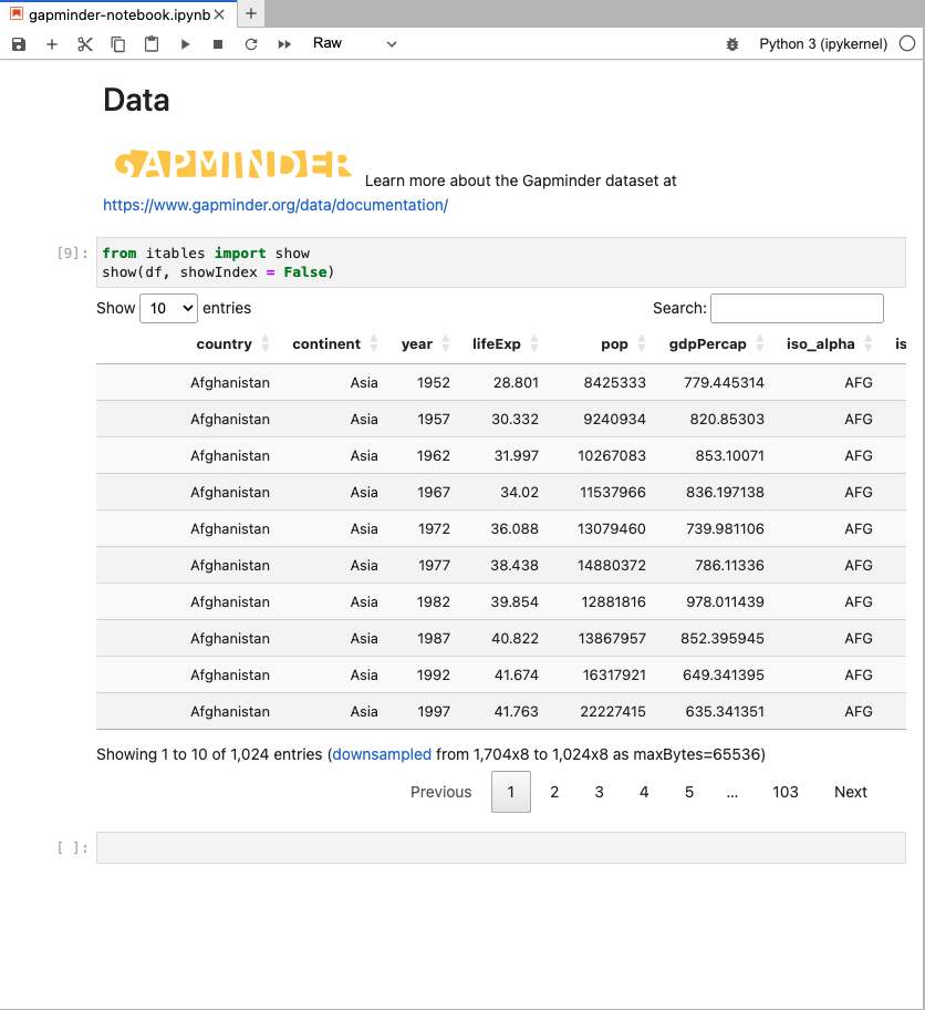
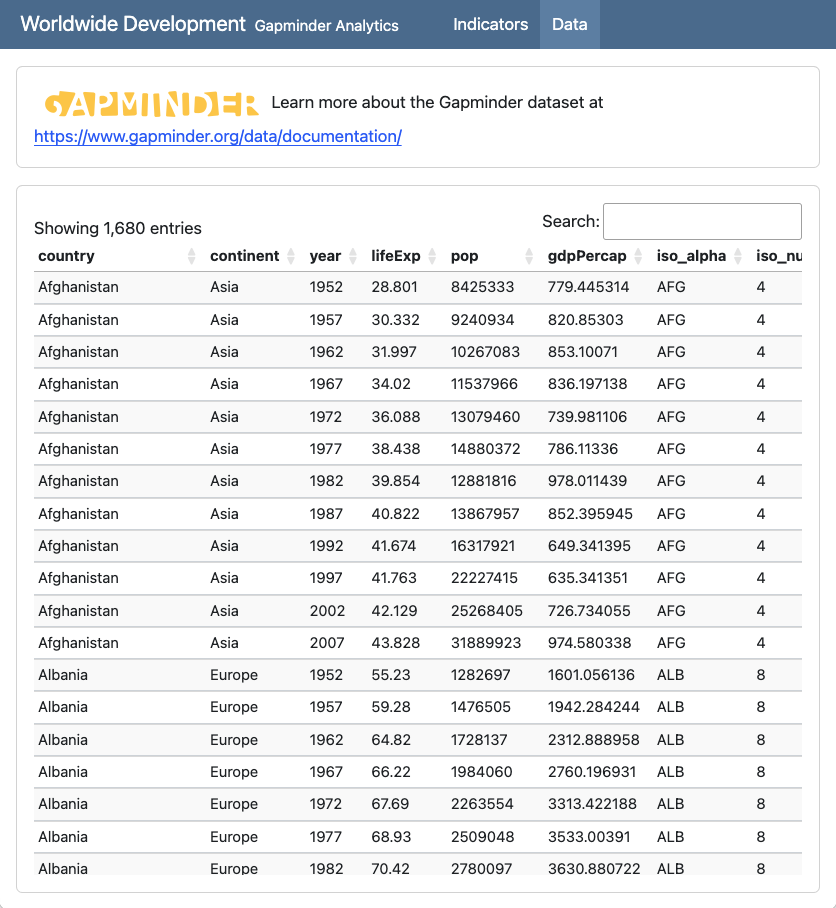
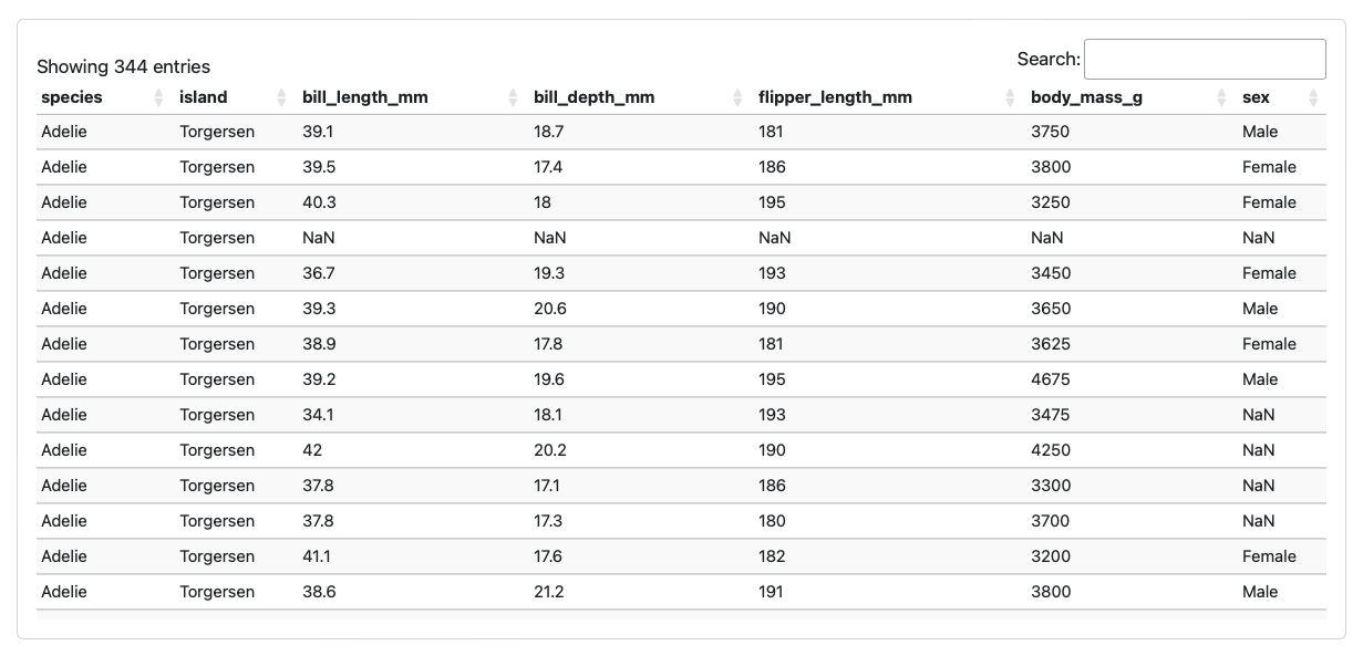
Tables
```{python}
from tabulate import tabulate
from IPython.display import Markdown
Markdown(tabulate(penguins, showindex=False)}
```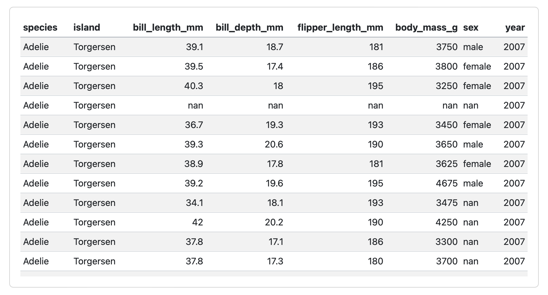
```{python}
from itables import show
show(penguins)
```
Value Boxes
## Row

```{python}
#| component: valuebox
#| title: "Current Price"
dict(icon = "currency-dollar",
     color = "secondary",
     value = get_price(data))
```

```{python}
#| component: valuebox
#| title: "Change"
change = get_change(data)
dict(value = change['amount'],
     icon = change['icon'],
     color = change['color'])
```
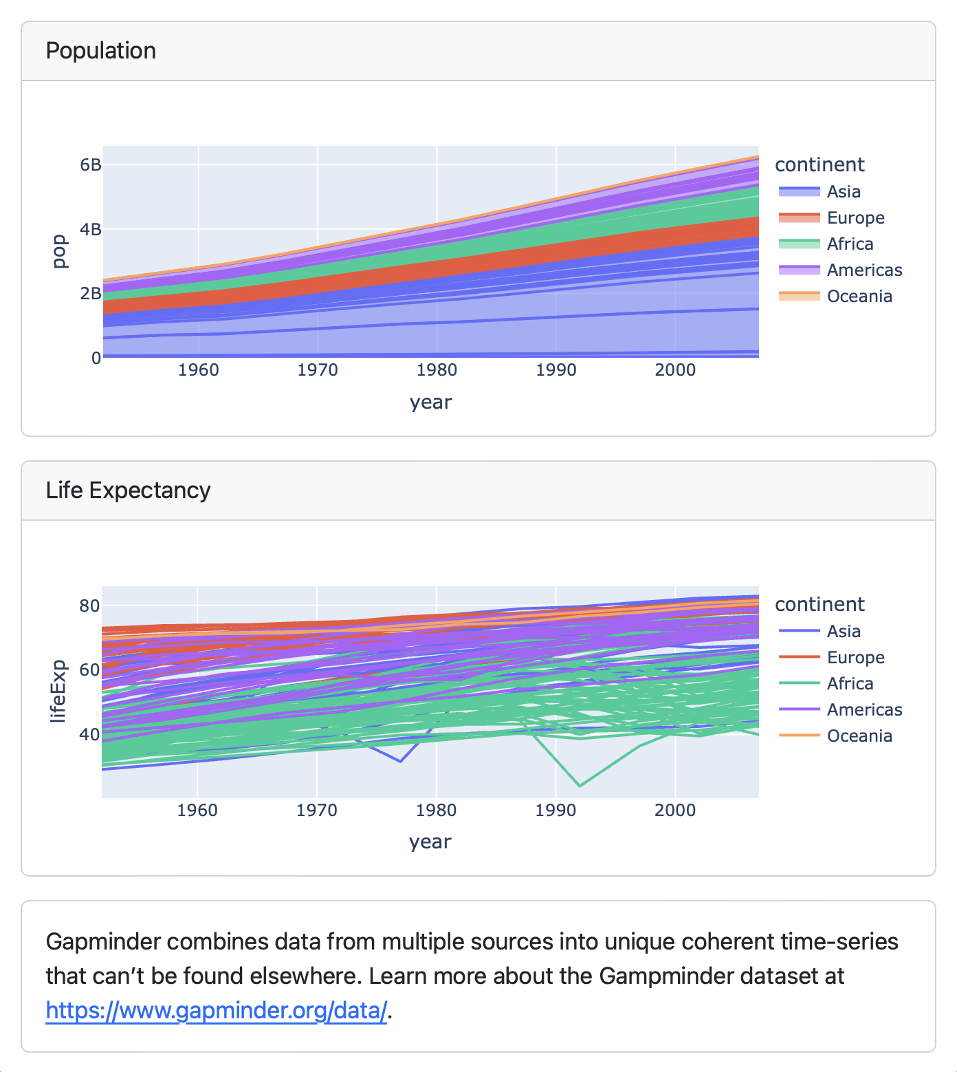
Text Content
## Column

```{python}
#| title: Population
px.area(df, x="year", y="pop",
        color="continent",
        line_group="country")
```

```{python}
#| title: Life Expectancy
px.line(df, x="year", y="lifeExp",
        color="continent",
        line_group="country")
```

::: {.card}
Gapminder combines data from multiple sources
into unique coherent time-series that can’t be
found elsewhere. Learn more about the Gampminder
dataset at <https://www.gapminder.org/data/>.
:::
Expanding Cards
Cards provide an Expand button which appears at bottom right on hover:
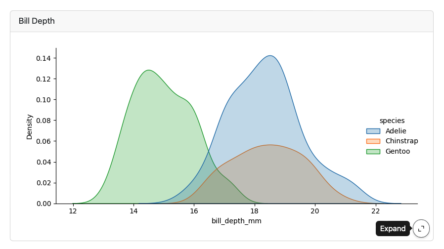
Expanding Cards
Parameterized Dashboards

Add a parameters tag to the first cell (based on papermill) :
```{python}
#| tags: [parameters]
ticker = "BA"
```
Use the -P command line option to vary the parameter:
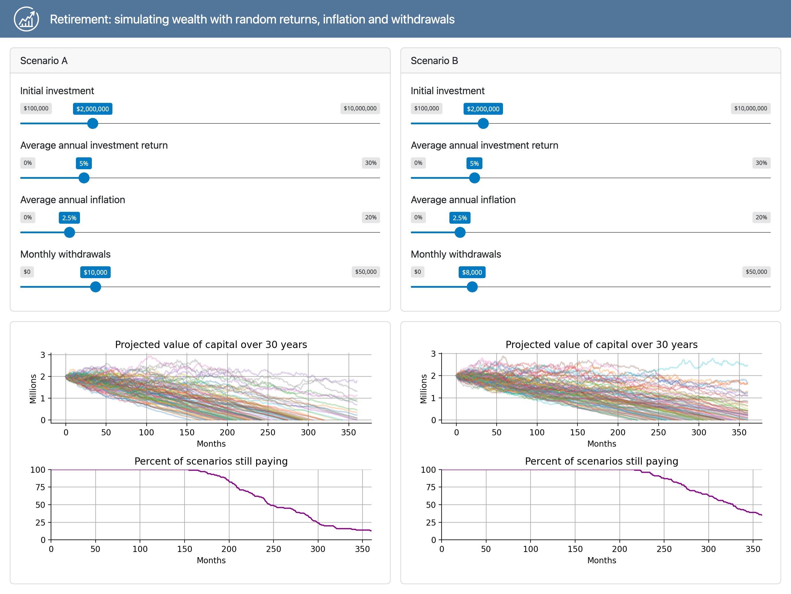
quarto render dashboard.qmd -P ticker:GOOGInteractive Dashboards
https://quarto.org/docs/dashboards/interactivity/shiny-python/
For interactive exploration, some dashboards can benefit from a live Python backend
To do this with Quarto Dashboards, add interactive Shiny components
Note that this requires a server for deployment
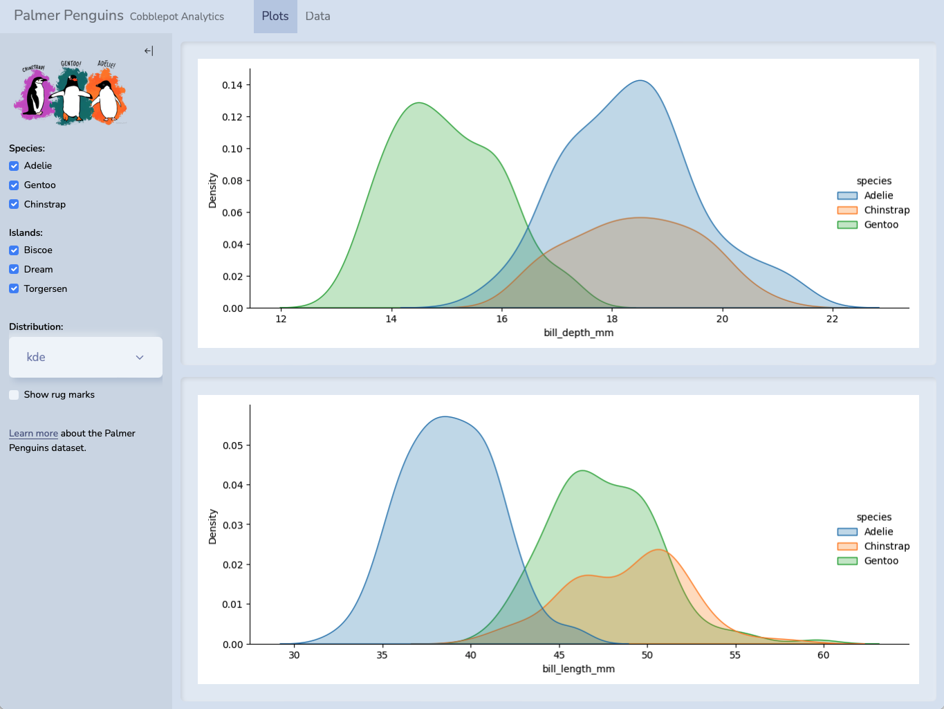
Hello, Shiny
---
title: "Penguin Bills"
format: dashboard
server: shiny
---

```{python}
import seaborn as sns
penguins = sns.load_dataset("penguins")
```

## {.sidebar}

```{python}
from shiny import render, ui
ui.input_select("x", "Variable:",
                choices=["bill_length_mm", "bill_depth_mm"])
ui.input_select("dist", "Distribution:", choices=["hist", "kde"])
ui.input_checkbox("rug", "Show rug marks", value = False)
```

## Column

```{python}
@render.plot
def displot():
    sns.displot(
        data=penguins, hue="species", multiple="stack",
        x=input.x(), rug=input.rug(),kind=input.dist())
```
Hello, Shiny

Shiny Deployment
References
Huge thanks the following people who have generated and shared most of the content of this lecture:
Mine Çetinkaya-Rundel: Build-a-Dashboard Workshop
J.J. Allaire: Dashboards with Jupyter and Quarto


Thanks for your attention and don’t hesitate to ask if you have any questions!
@damien_dupre
@damien-dupre
https://damien-dupre.github.io
damien.dupre@dcu.ie